
Kontakt
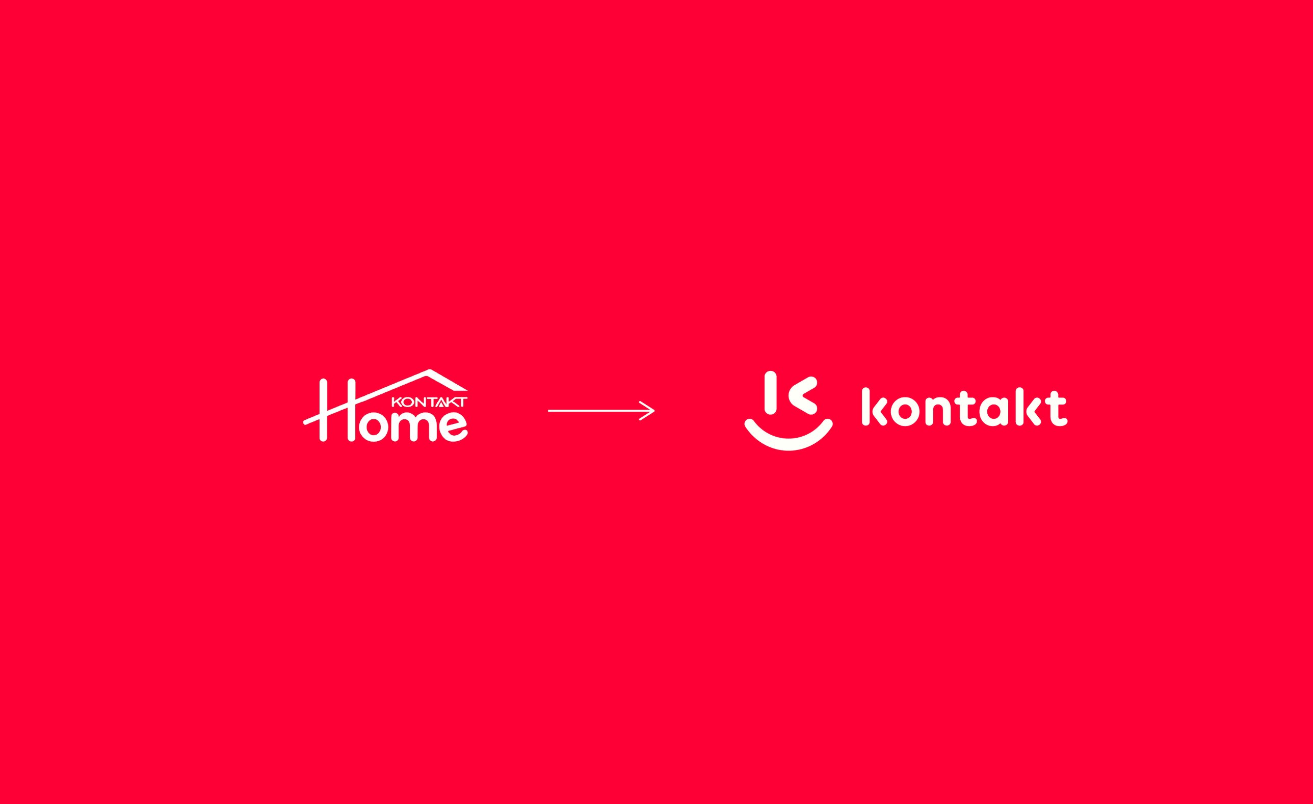
Kontakt wanted a brand that would show off its great customer service, but it had no face. I gave it one, a winking smile, and a line to go with it: Kontakt sevindirir, Kontakt brings joy.
A brand that said Home but meant service
Kontakt started in 2006 as a phone shop and grew into a chain selling electronics, appliances and furniture. The logo was led by the word Home under a little roof, which read like a furniture store, with Kontakt itself barely visible.
The team had already spent months trying to fix the logo in house, which told me the logo wasn’t the real problem. The business needed a brand bigger than one word and closer to its service.
Great service, said with a smile
Kontakt’s strength was its customer service, so the brand had to say that before anything else. I wrote the line Kontakt sevindirir, Kontakt brings joy, and the smile in the mark carries it.
One firm rule followed: Kontakt leads and Home follows. Home was dropped in stages, only once customers knew the new face.
A logo that winks before it sells
The old brand had no face. The new mark joins a K with a winking smile, so the brand says hello before it asks for anything.
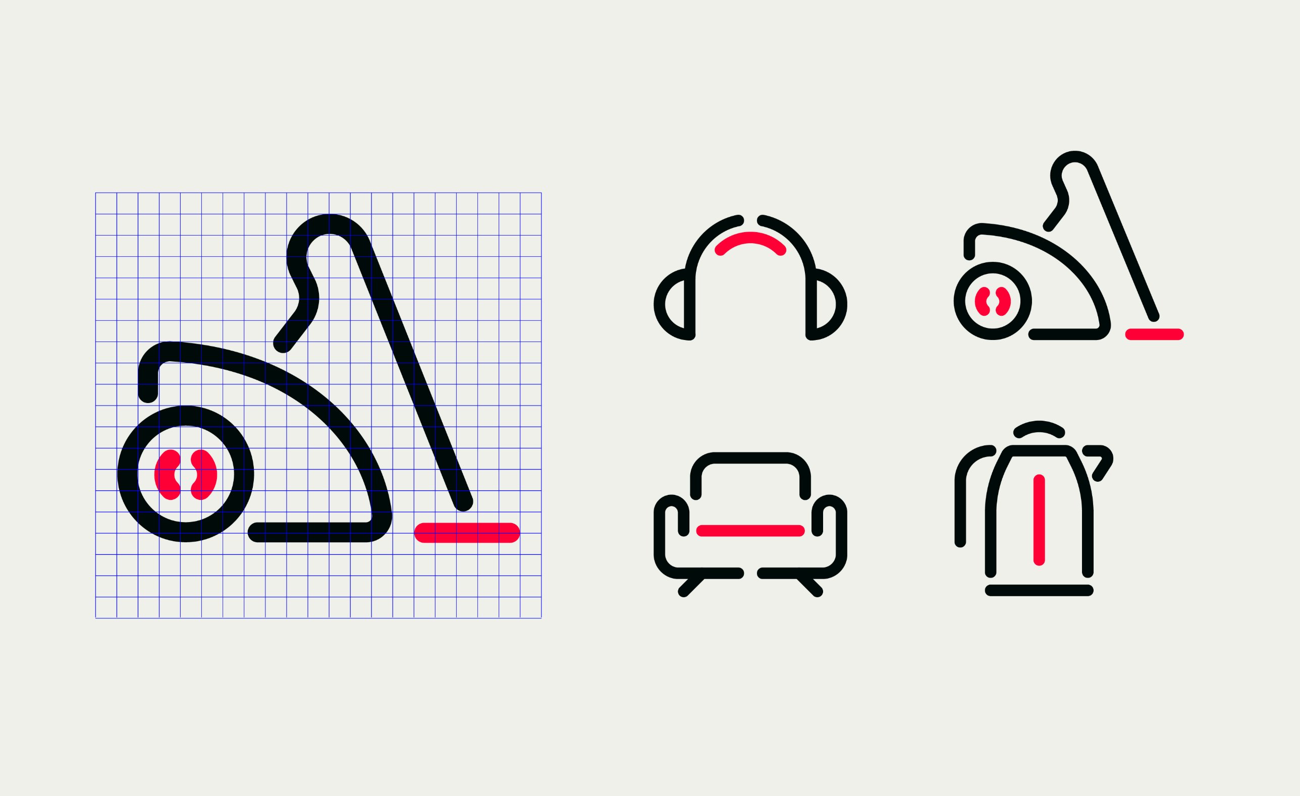
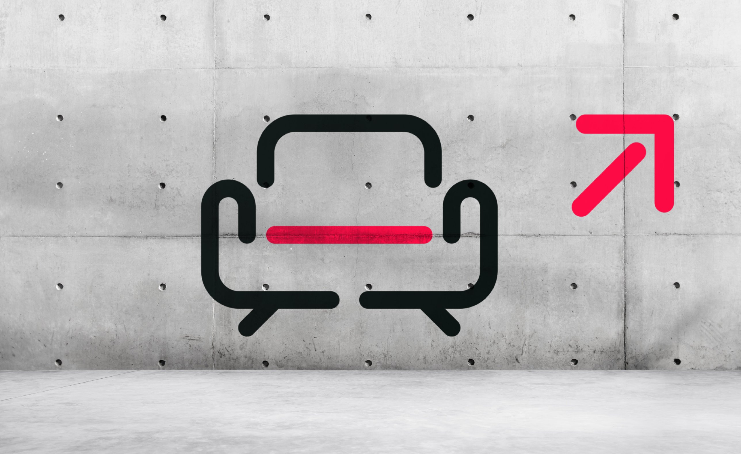
Around it I built the full system, with a line icon for every product category and a tone of voice that sounds like a friend in the shop rather than a price list.


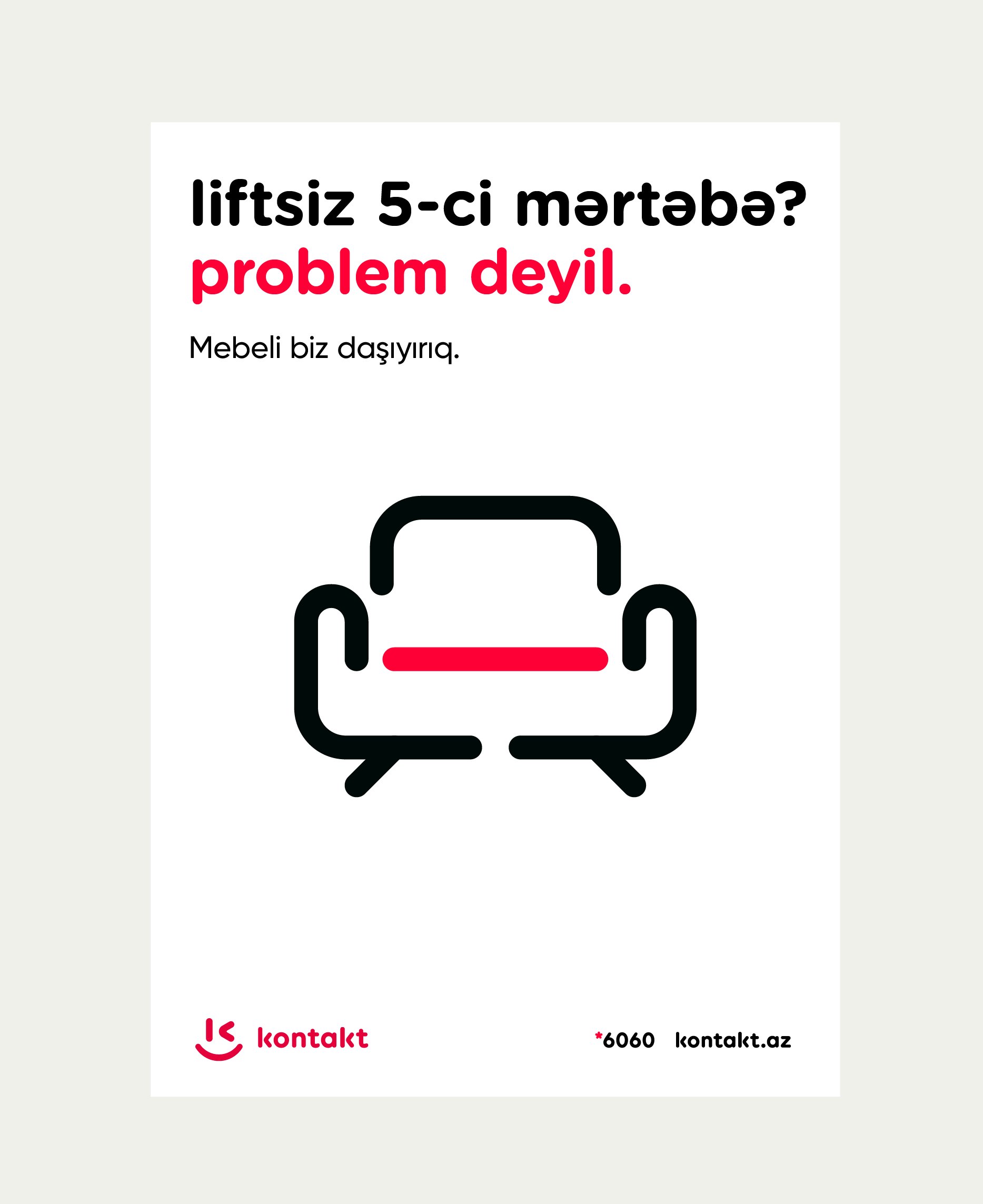
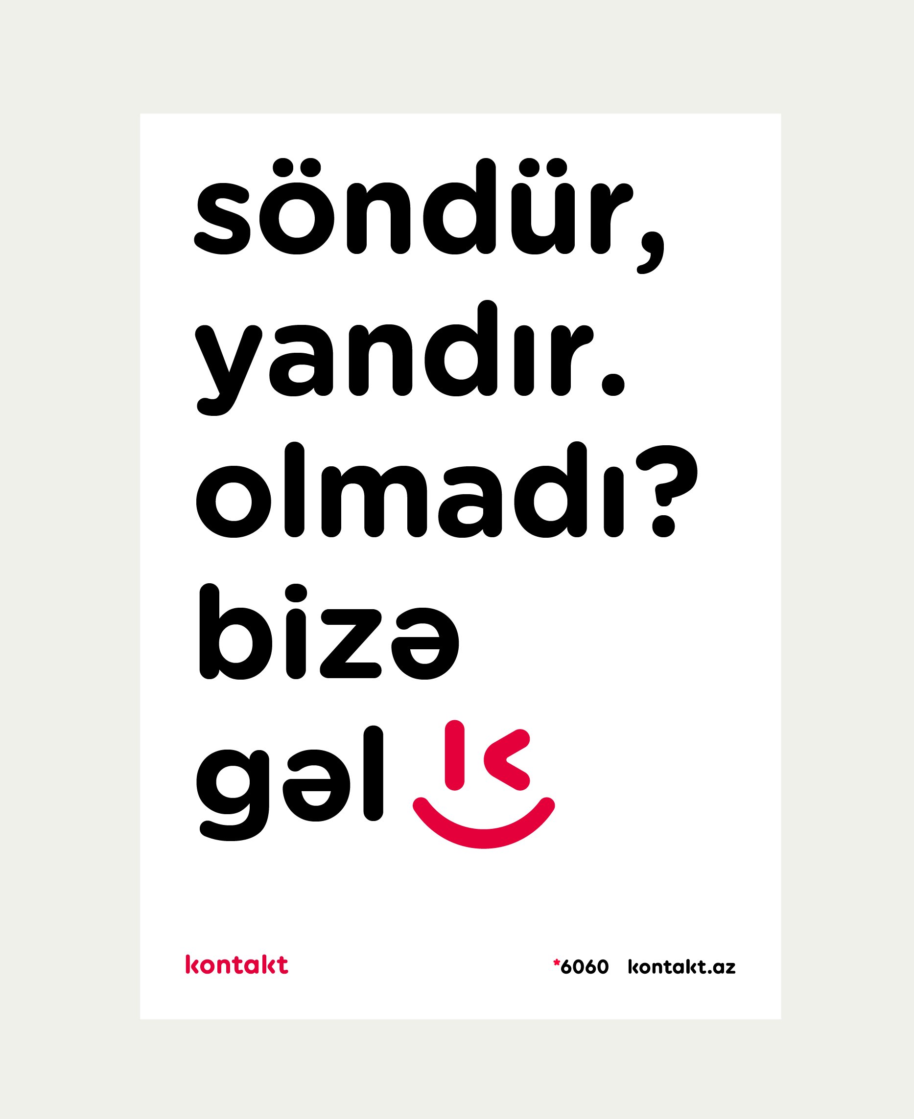
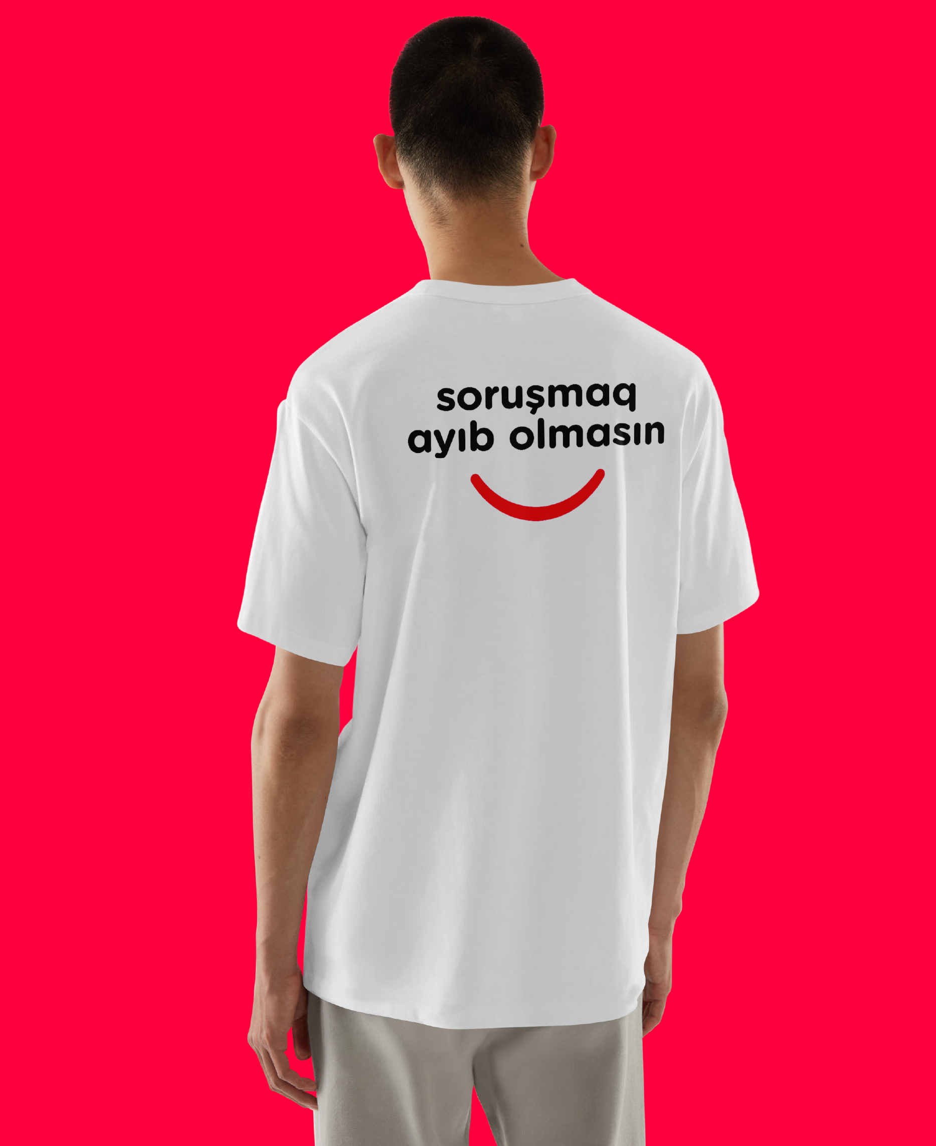
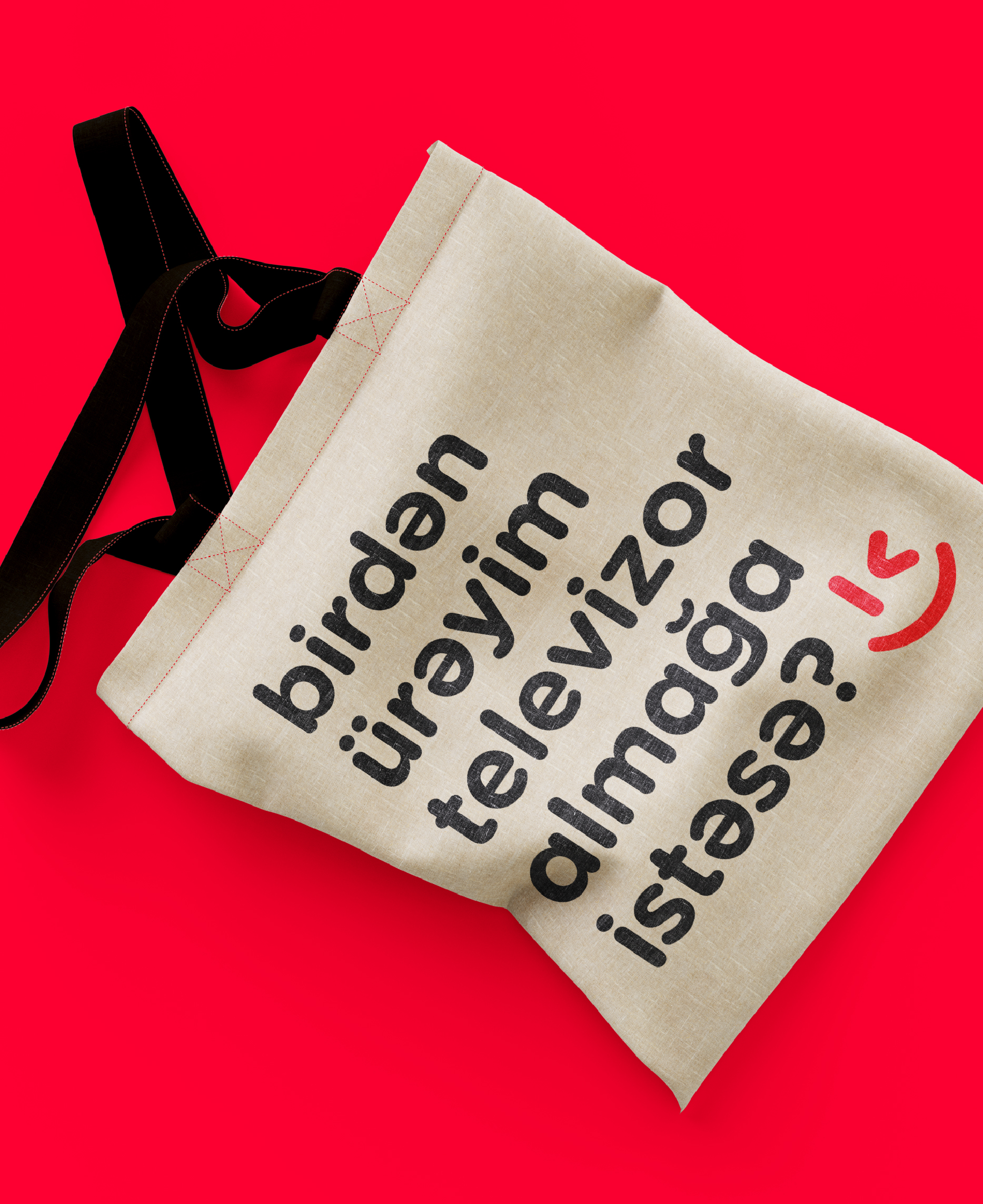
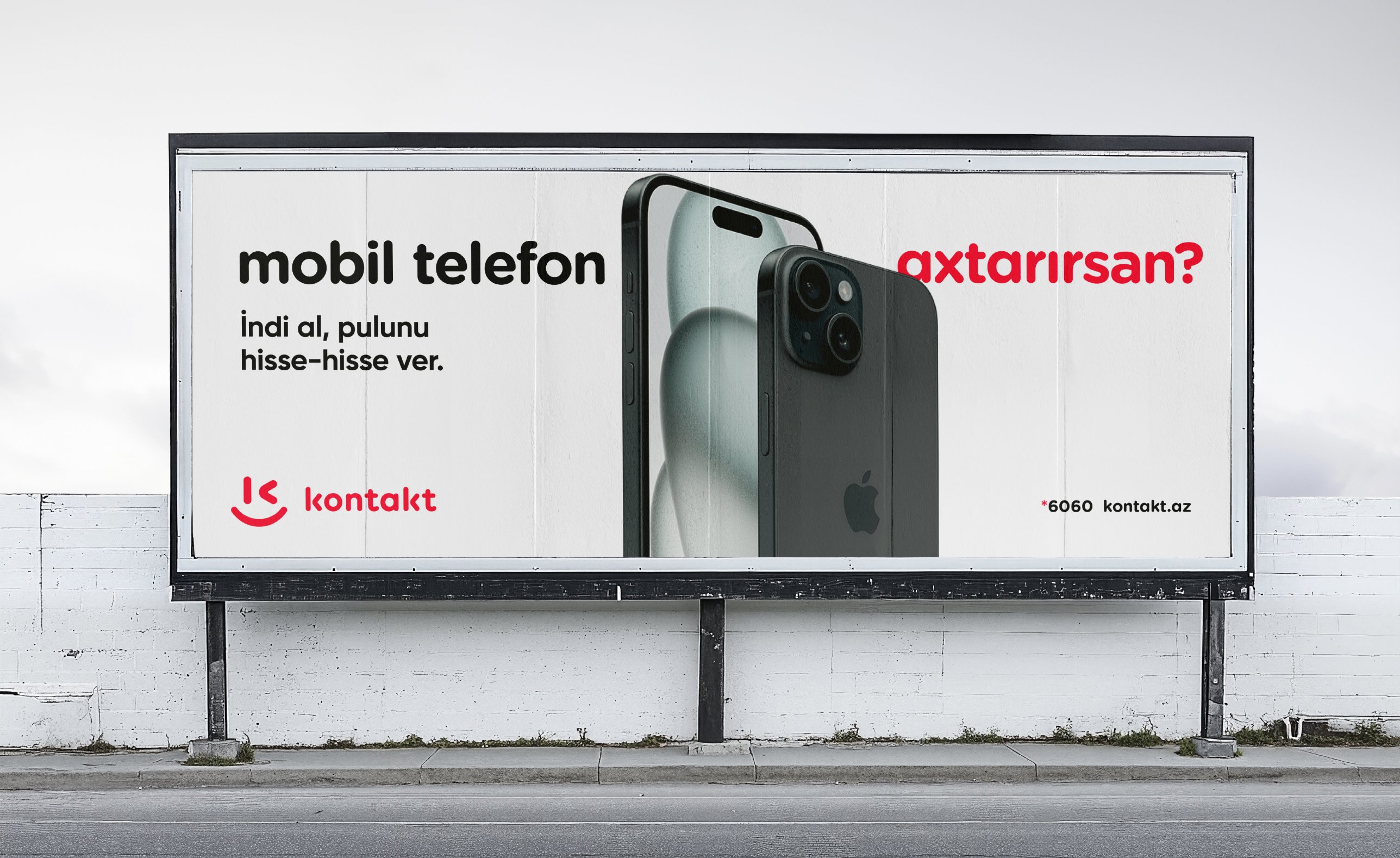
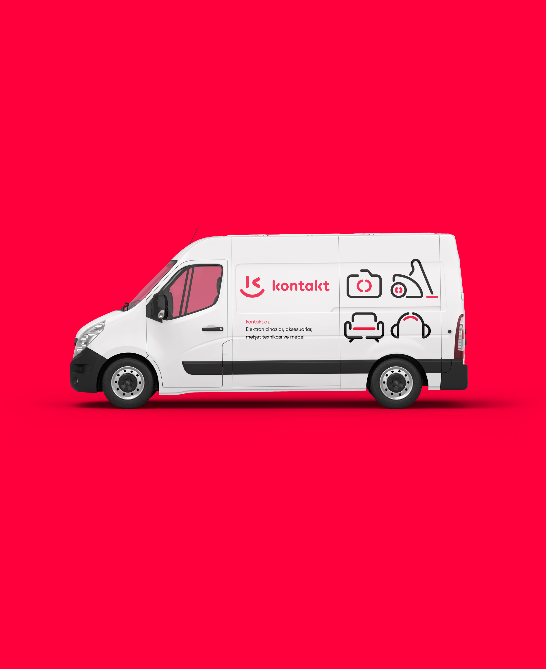
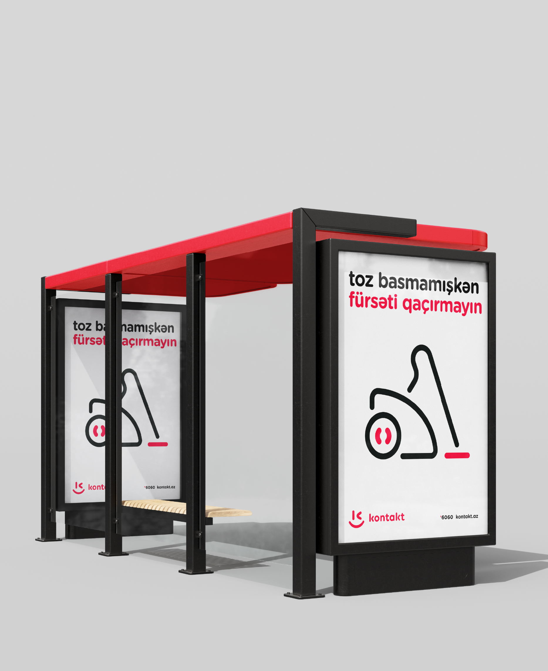
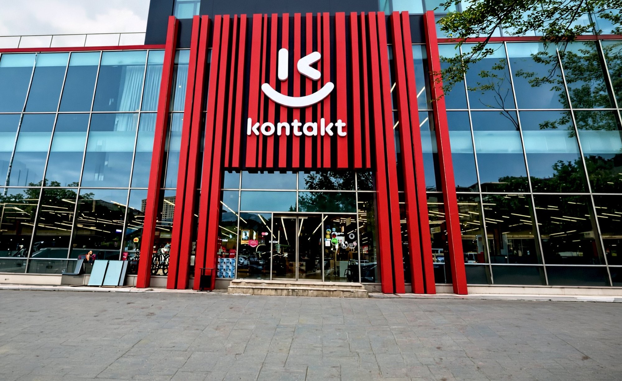
Everything that moves and everything that stands still
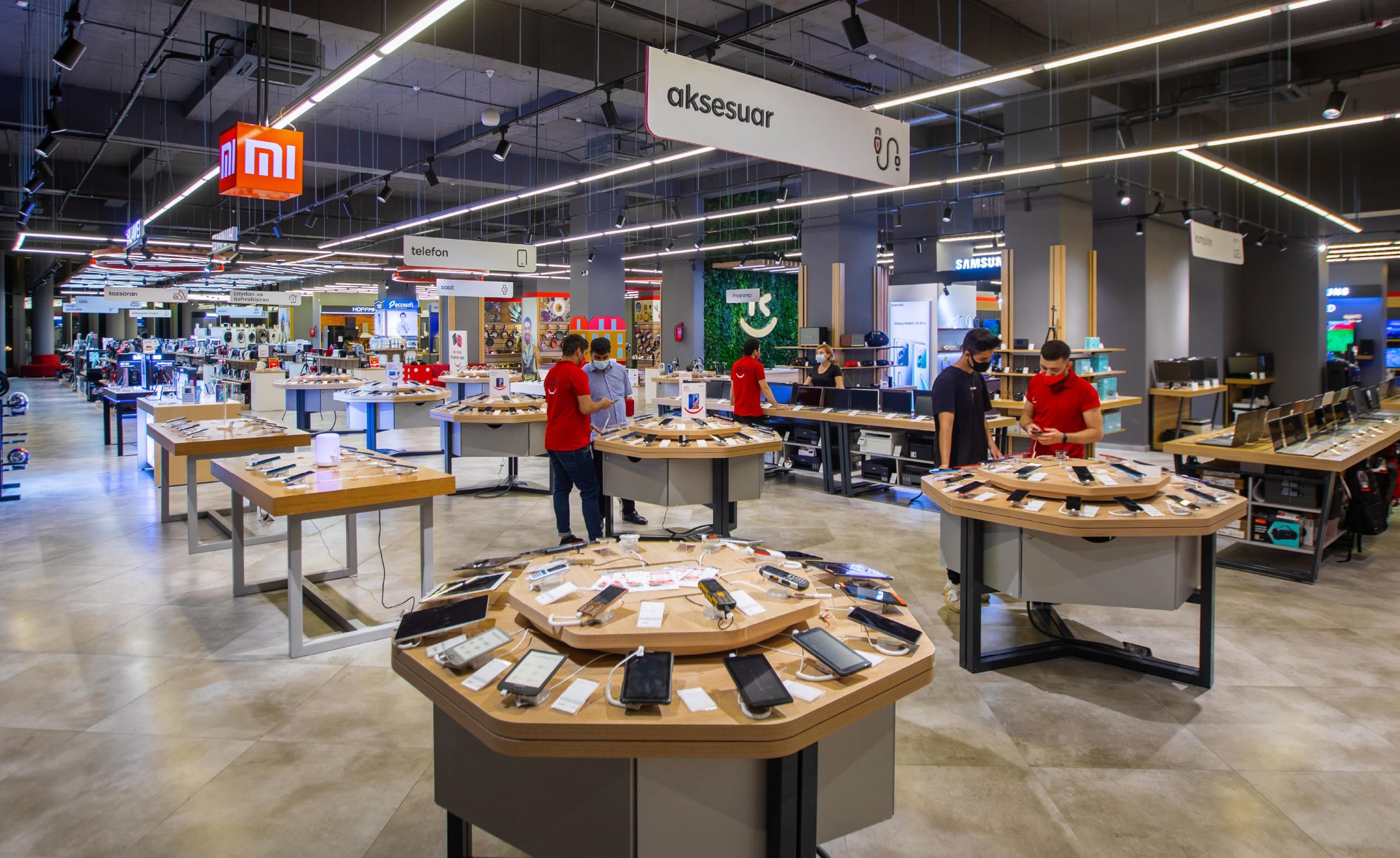
A retail brand lives on vans, bus shelters and shop fronts long before anyone opens the app. I took the identity across all of it, down to the lines printed on tees and totes.
Built to work without me
Beyond the identity I set up the brand architecture and sub brands, wrote the guidelines, trained the team and set up the design workflow they still use. In 2021 the brand crossed into Georgia, adapted to the Georgian script.
Kontakt now has a large in house creative team, and I still consult on the brand.
96% know the name
According to the CEO, name recognition reached 96% after the rebrand. Today Kontakt runs more than 50 stores in Azerbaijan and has traded in Georgia since 2021.