Bloomwards
A youth education company needed a name parents could trust and teenagers would actually wear.
A name stuck in one valley
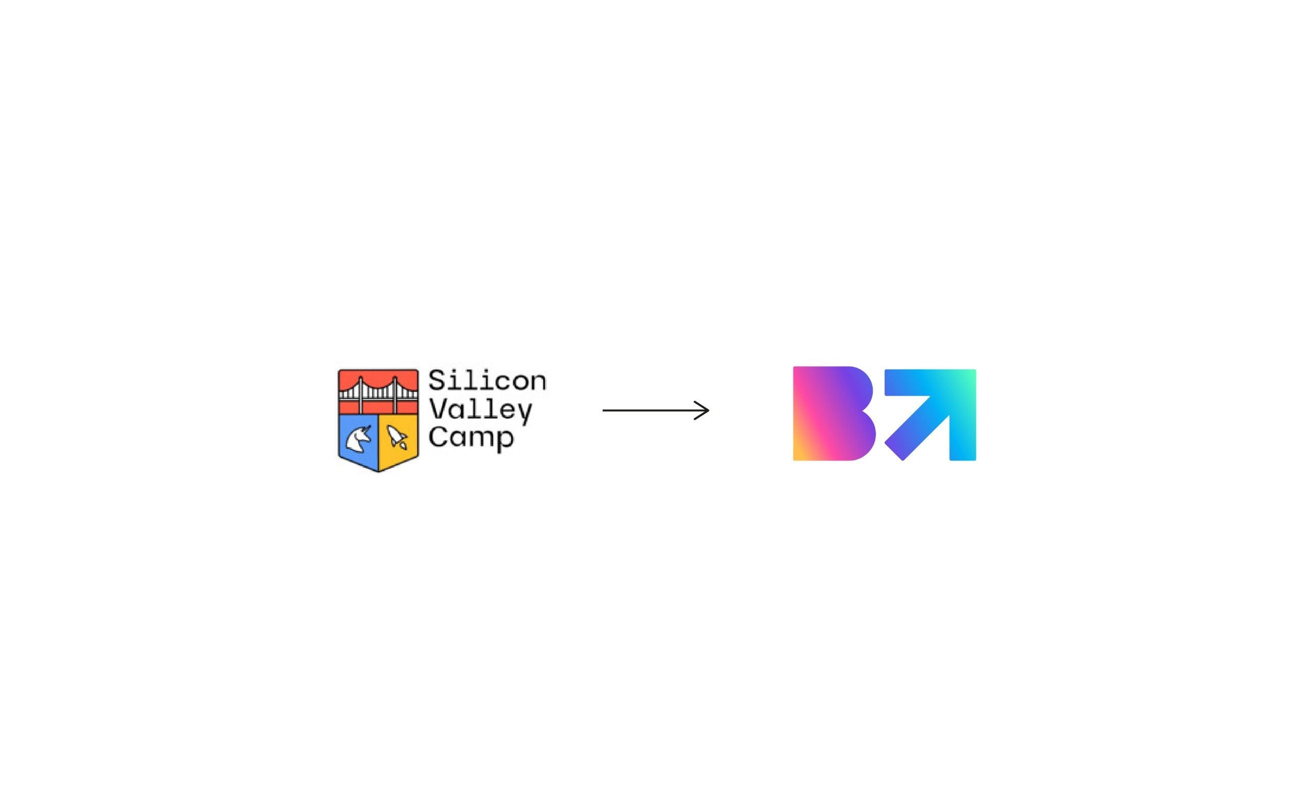
The client came to me as Silicon Valley Camp, running travel camps for teenagers. The name tied the business to one place and one product, and the crest needed a Golden Gate, a unicorn and a rocket just to say “tech”.
Meanwhile the company was growing into an academy, coaching and a conference, and it needed a name that could hold all of them.
Parents pay, teenagers decide
Parents choose and pay, so they need to feel their child is in competent hands. Teenagers decide whether a brand is worth being seen with.
So the brand speaks two ways at once, with a calm, sincere promise for parents and a loud, bright identity for teenagers.
Seven routes, one direction
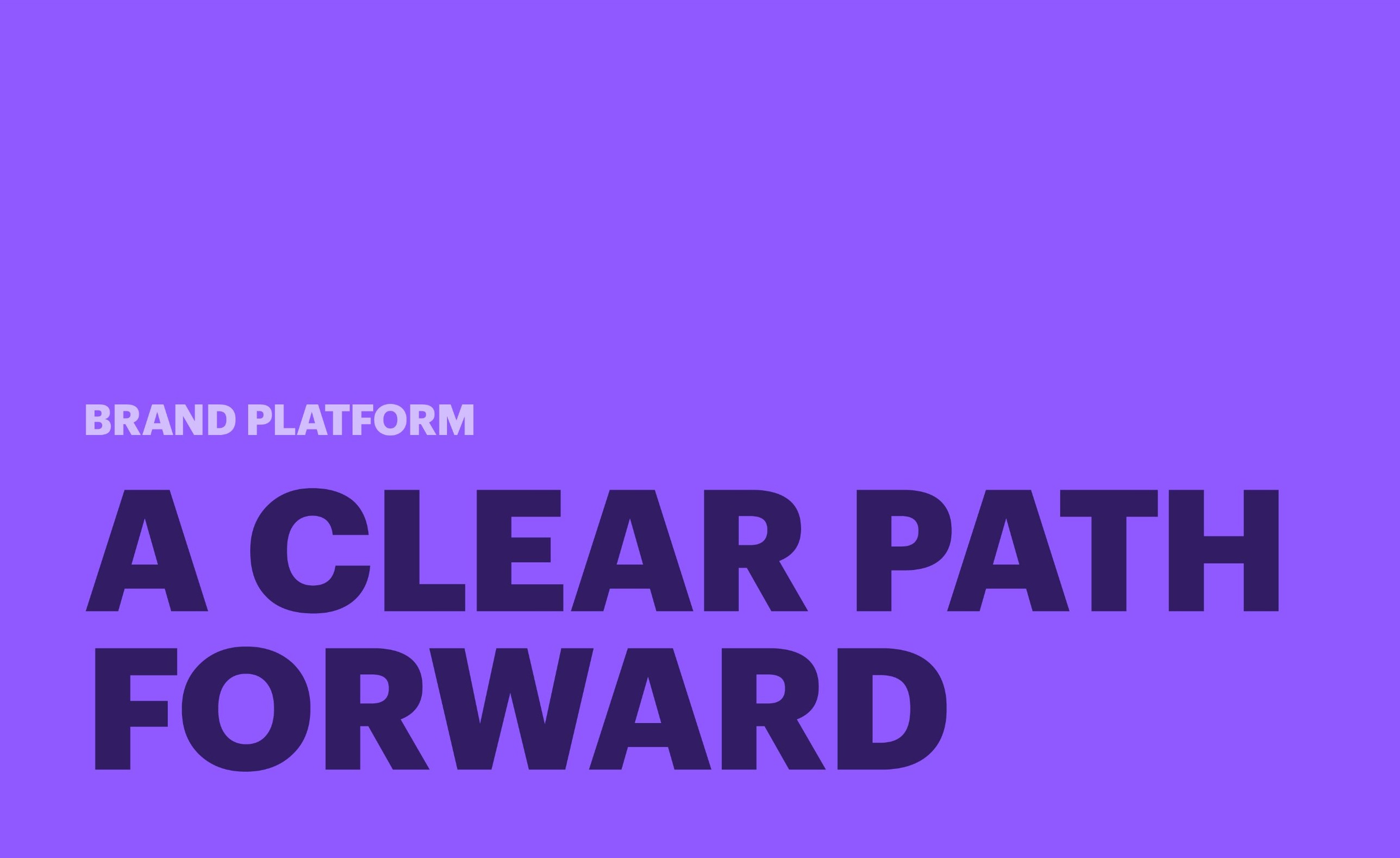
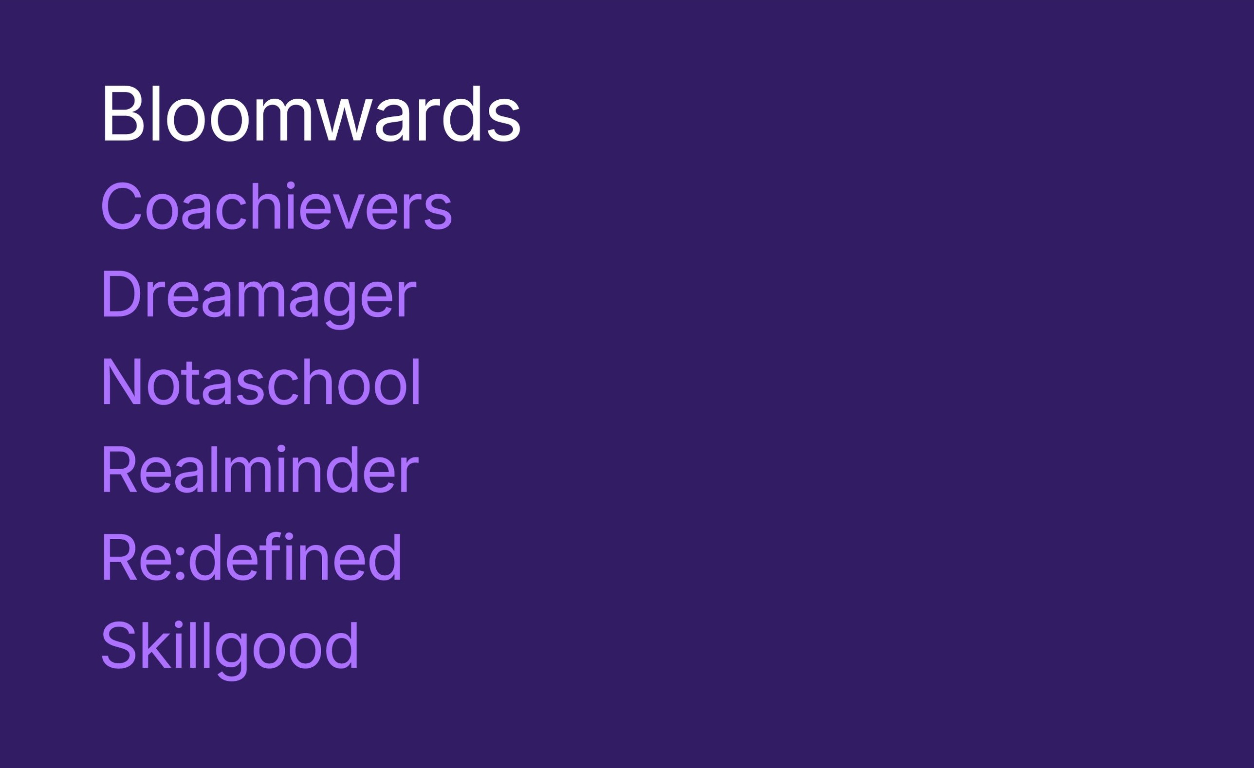
I proposed seven names. Bloomwards won because it reads as a direction: bloom for growth, and wards as in forwards and upwards.
Every teenager blooms in their own time, and Bloomwards is the direction they grow in.
A B with somewhere to go
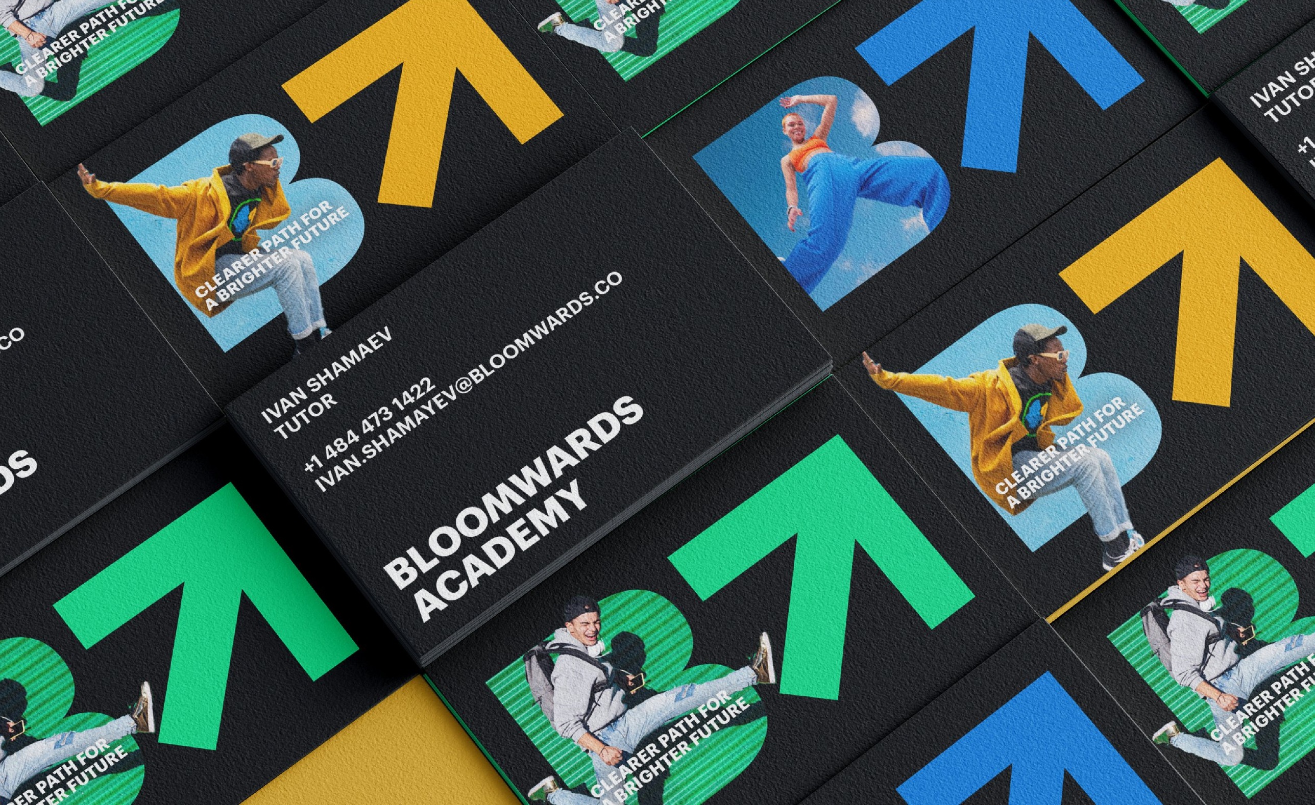
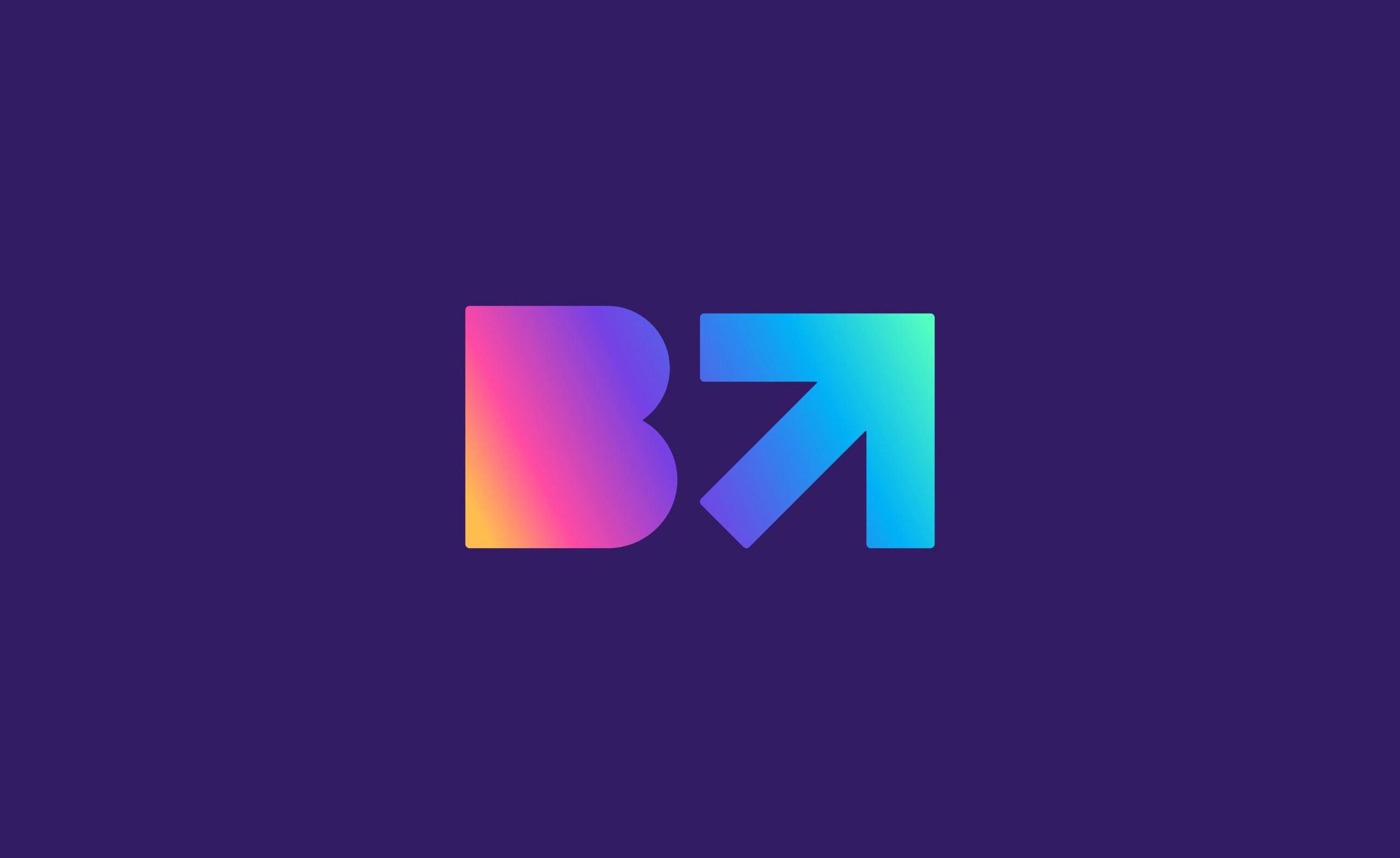
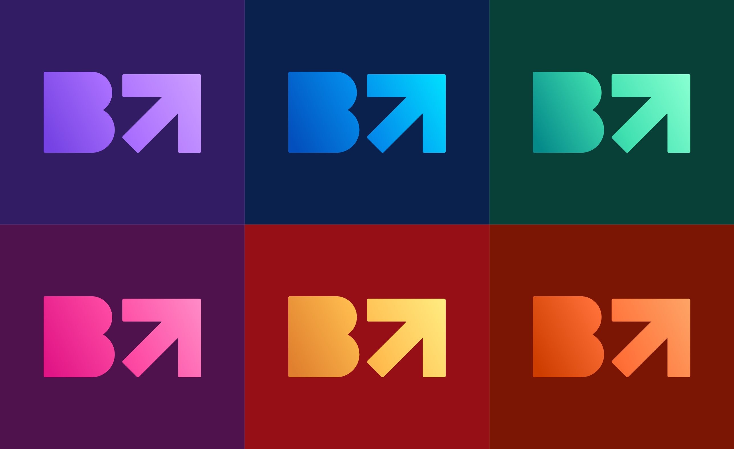
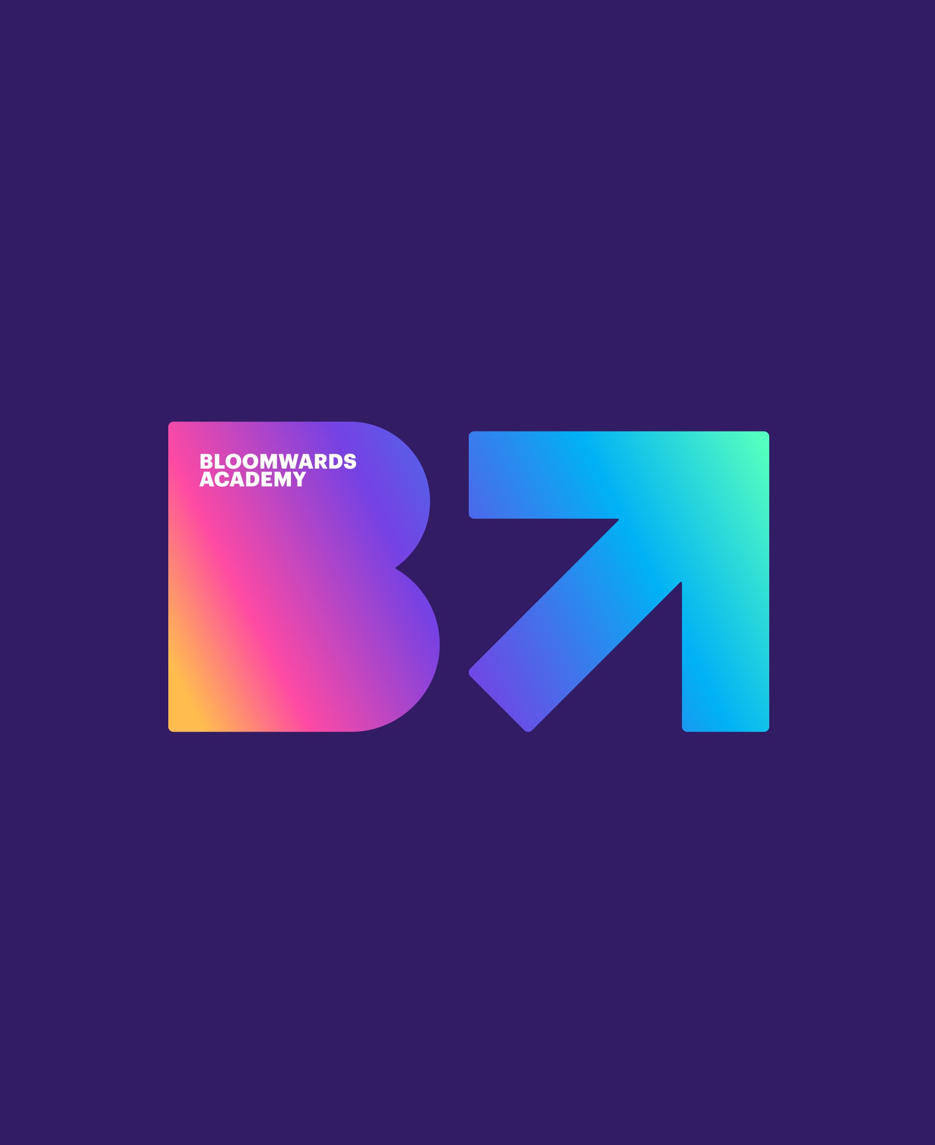
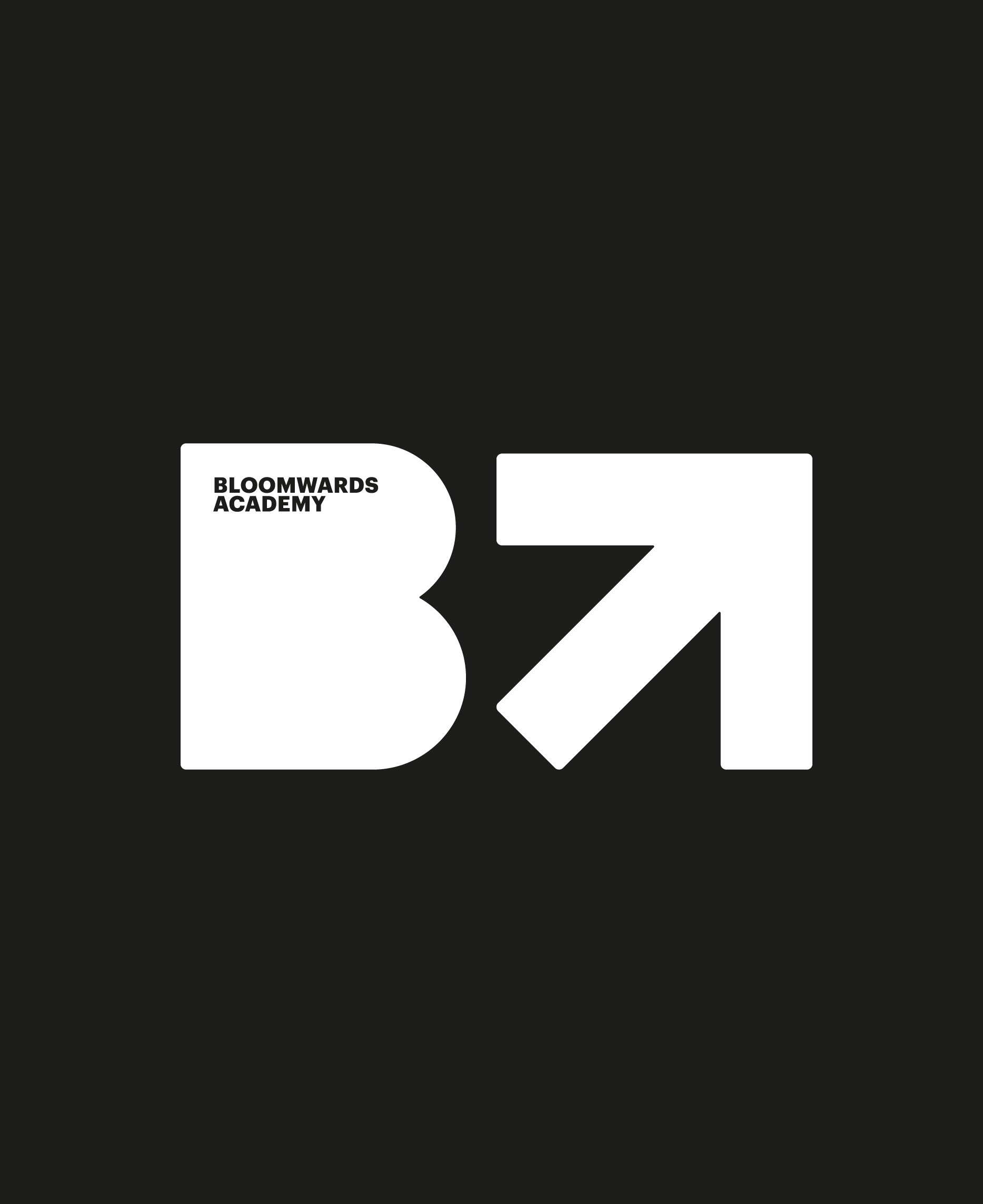
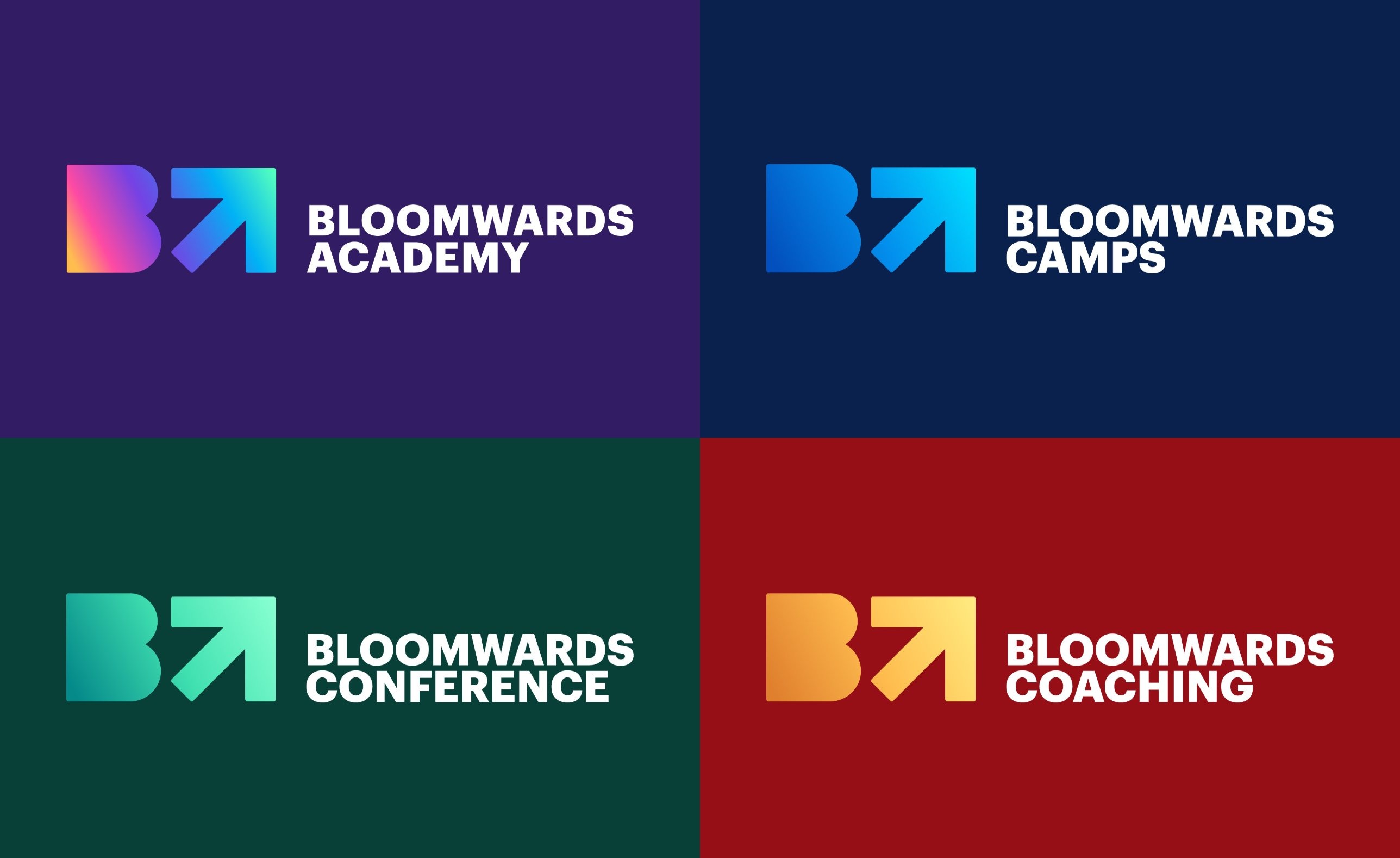
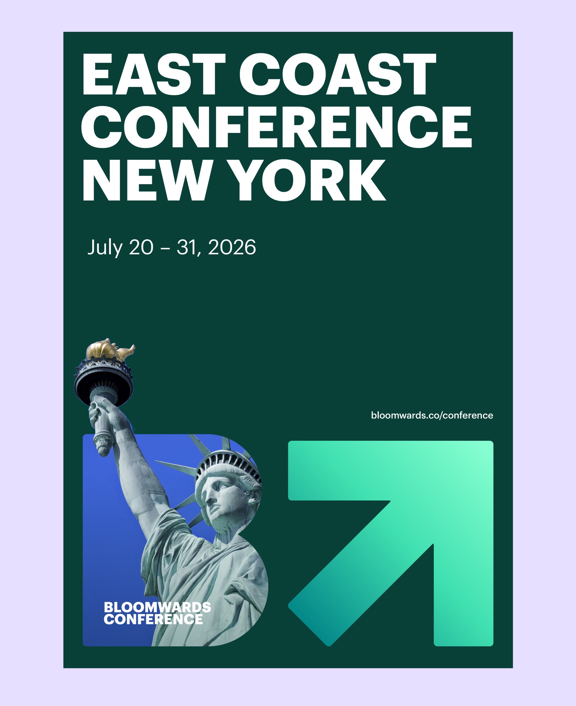
The mark spells the name, with a heavy B for bloom and an arrow beside it pointing up and forward. Six gradients give every programme its own colour while the shape never changes.
Academy, Camps, Conference and Coaching each take a colour from the system, so they read as separate products and one family at a glance.


Any photo becomes the brand
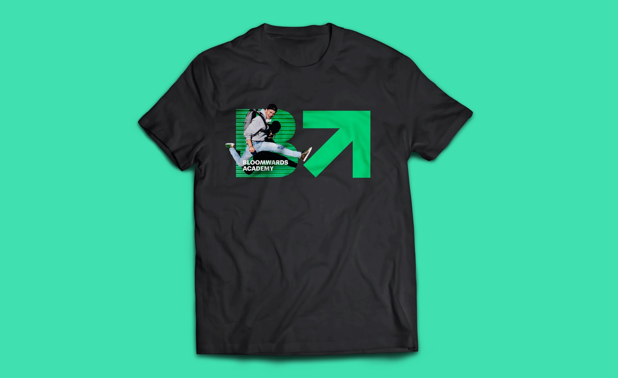
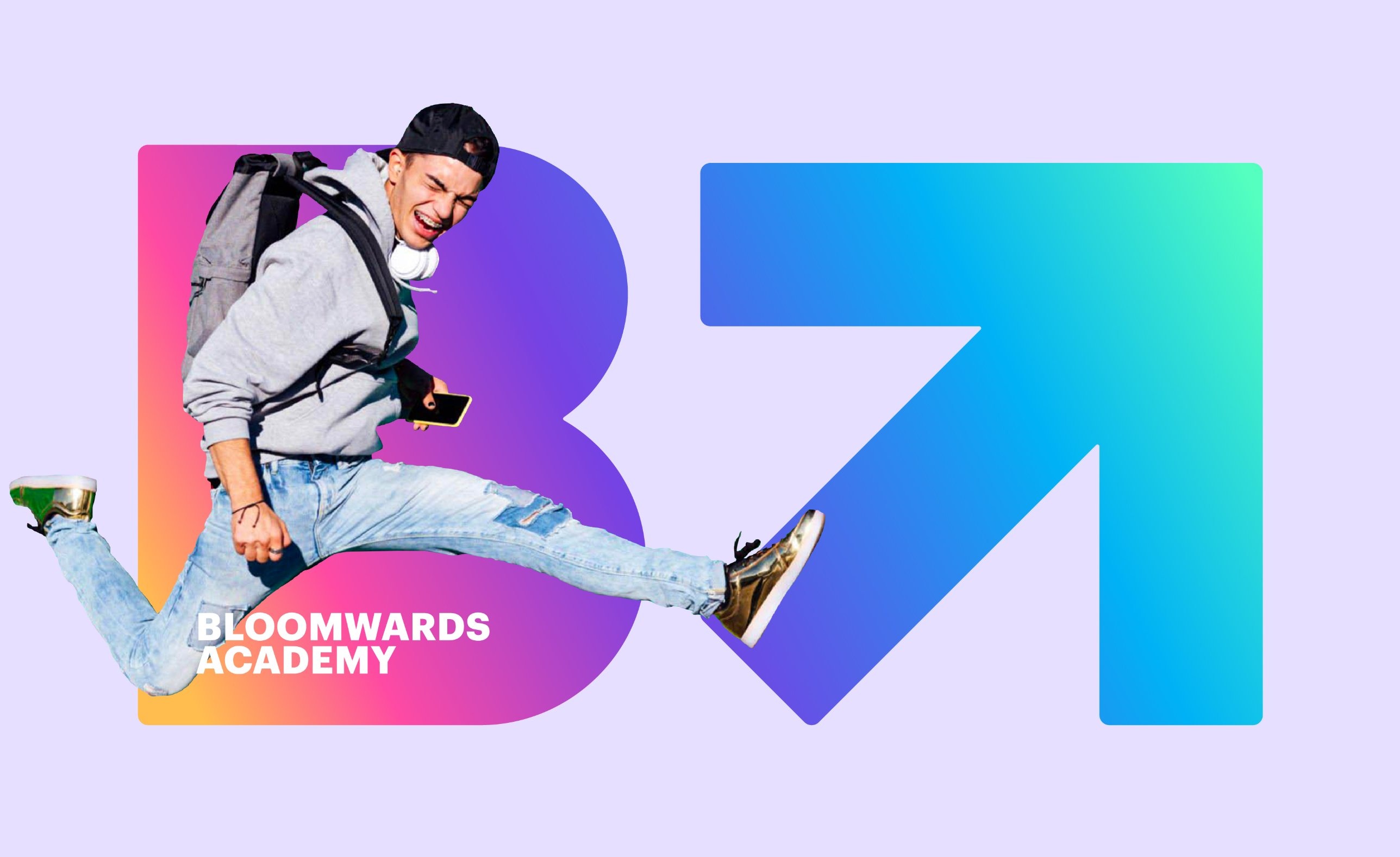
Photography sits inside the B, so any picture turns into part of the identity. The campaign gives teenagers energy and gives parents a promise: a clear path to a brighter future.


Would a teenager actually wear it?
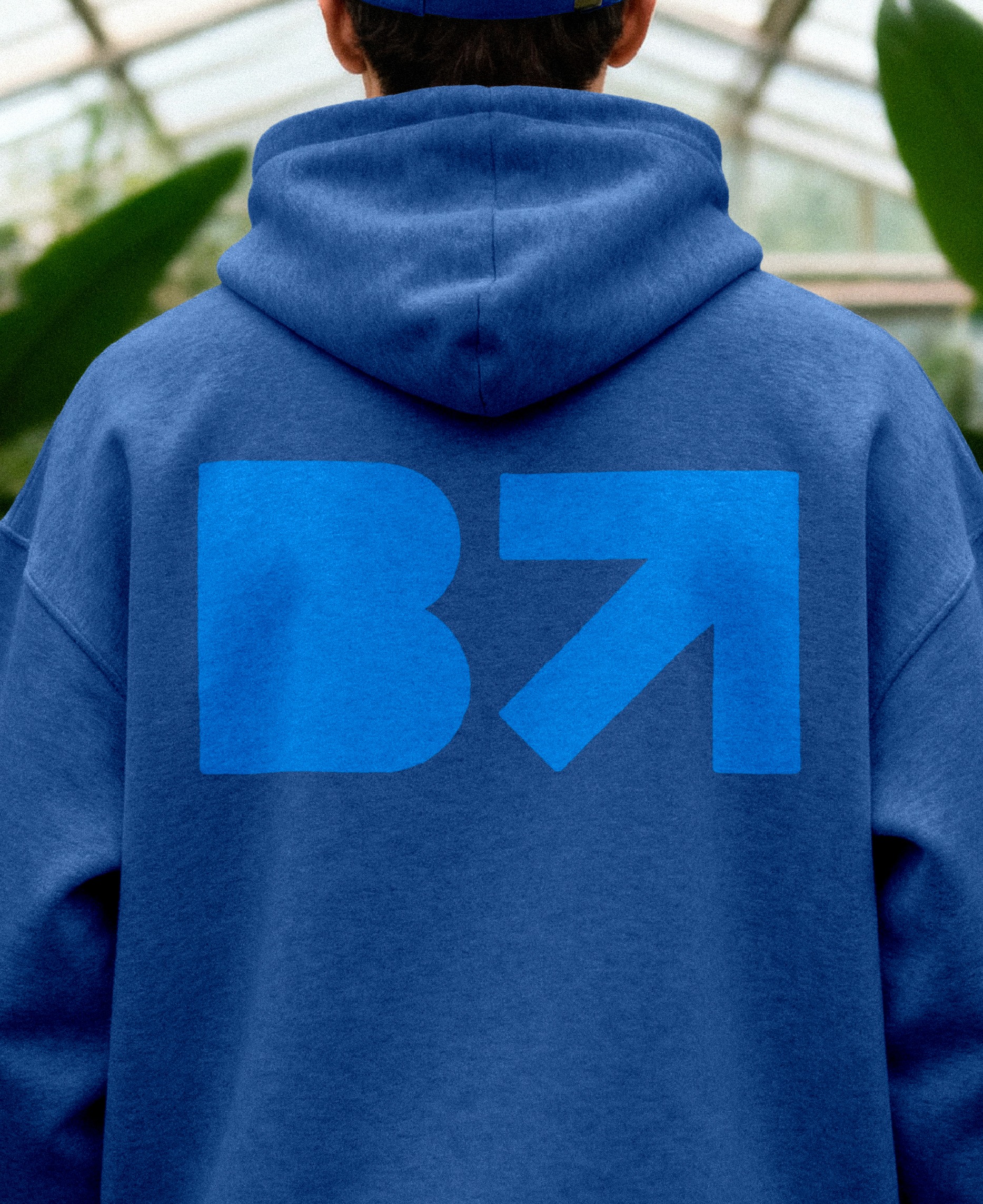
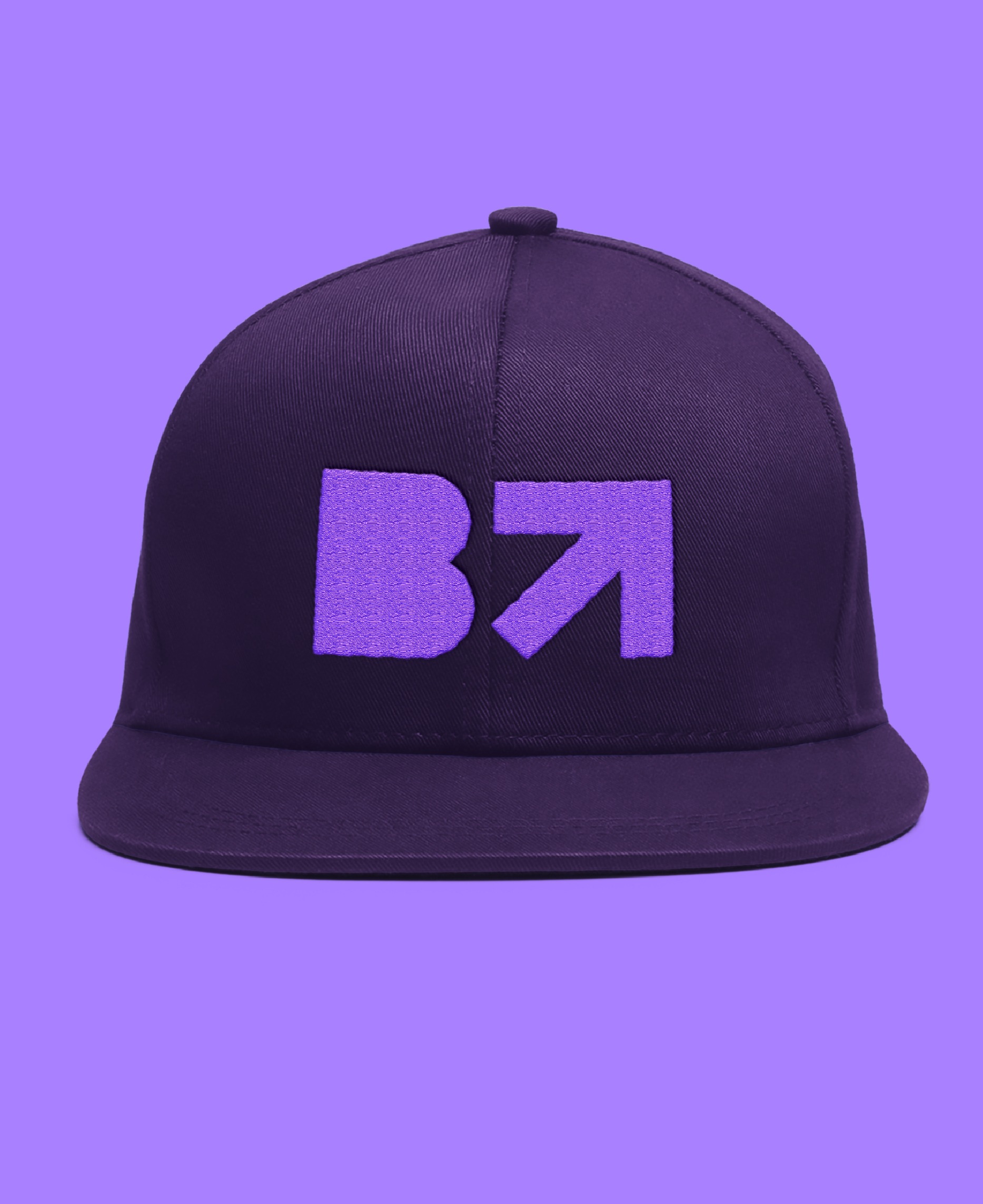
That was the client’s test, and the mark passes it as a graphic on its own, on hoodies, caps and tees. Bloomwards launched in 2024, and the identity is live across the company’s site and programmes.