21st Century School
The school wanted a shield and had nothing to put in it. So the name went inside.
A school called 21st Century, with a logo that read 13
I won the project through a tender with a short brief. The old logo was an IB monogram that also read as 13, nobody liked it, and it said nothing about the school.
They wanted more than a logo, they wanted an identity the whole school could live with.
A crest with nothing to carry
The one clear wish was a shield, the classic school crest. But a crest needs something inside it, and there was no history, symbol or story to put there.
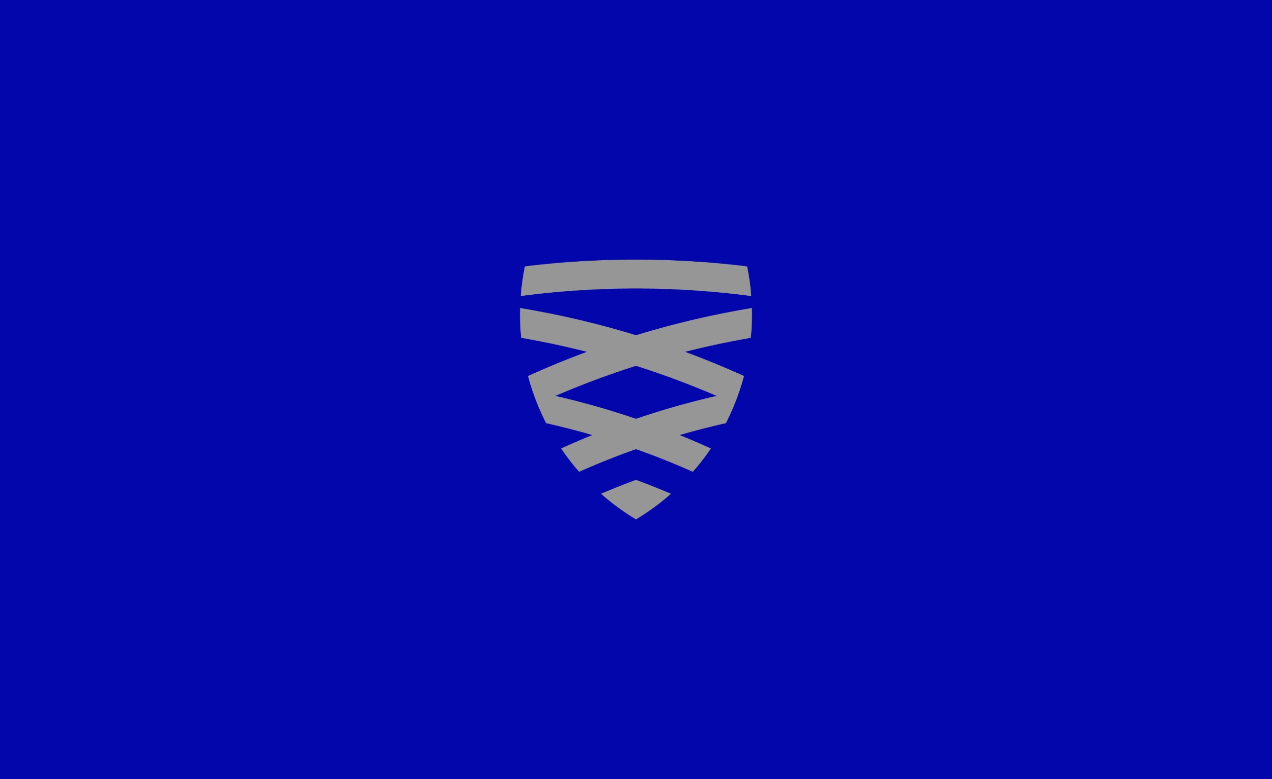
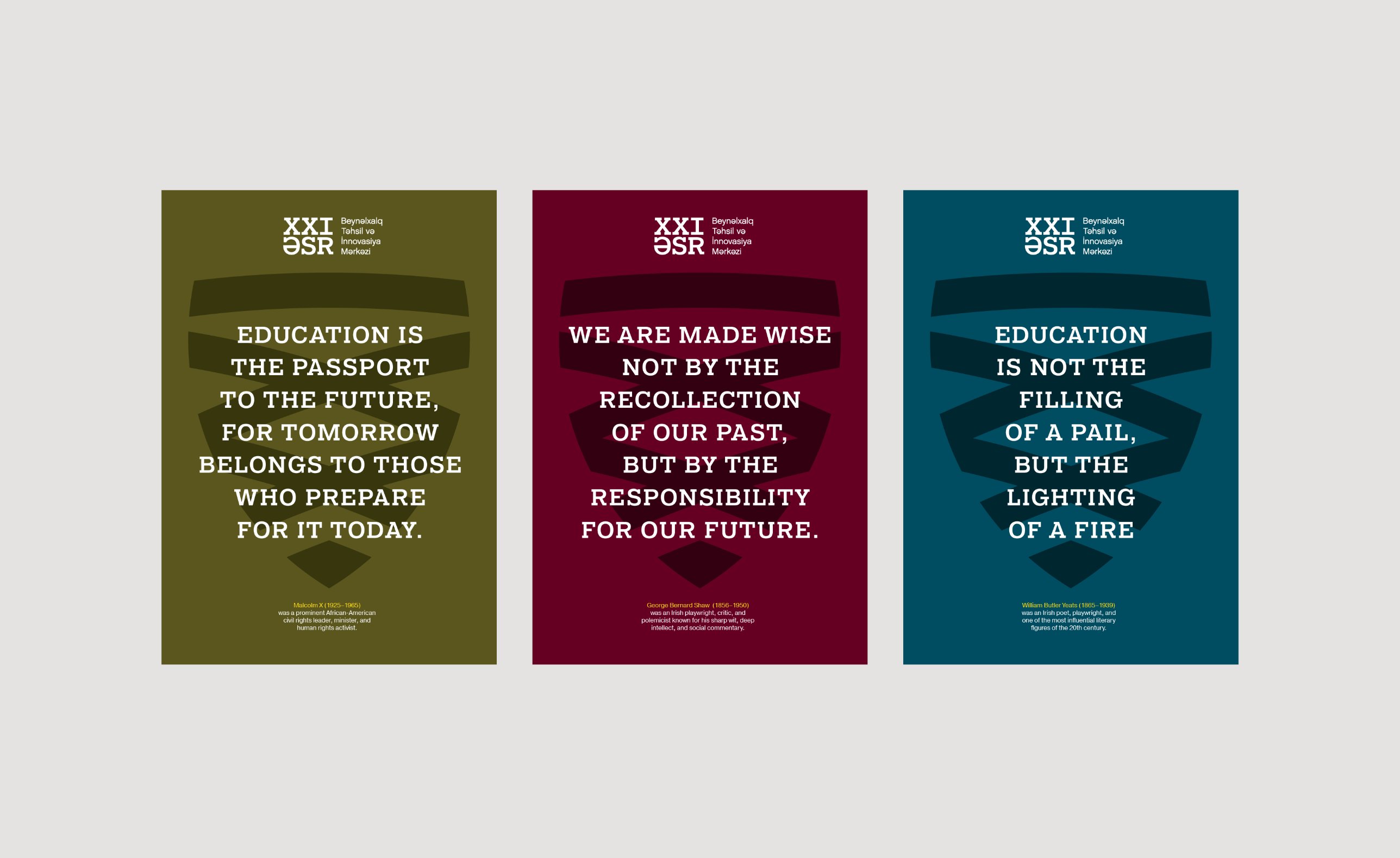
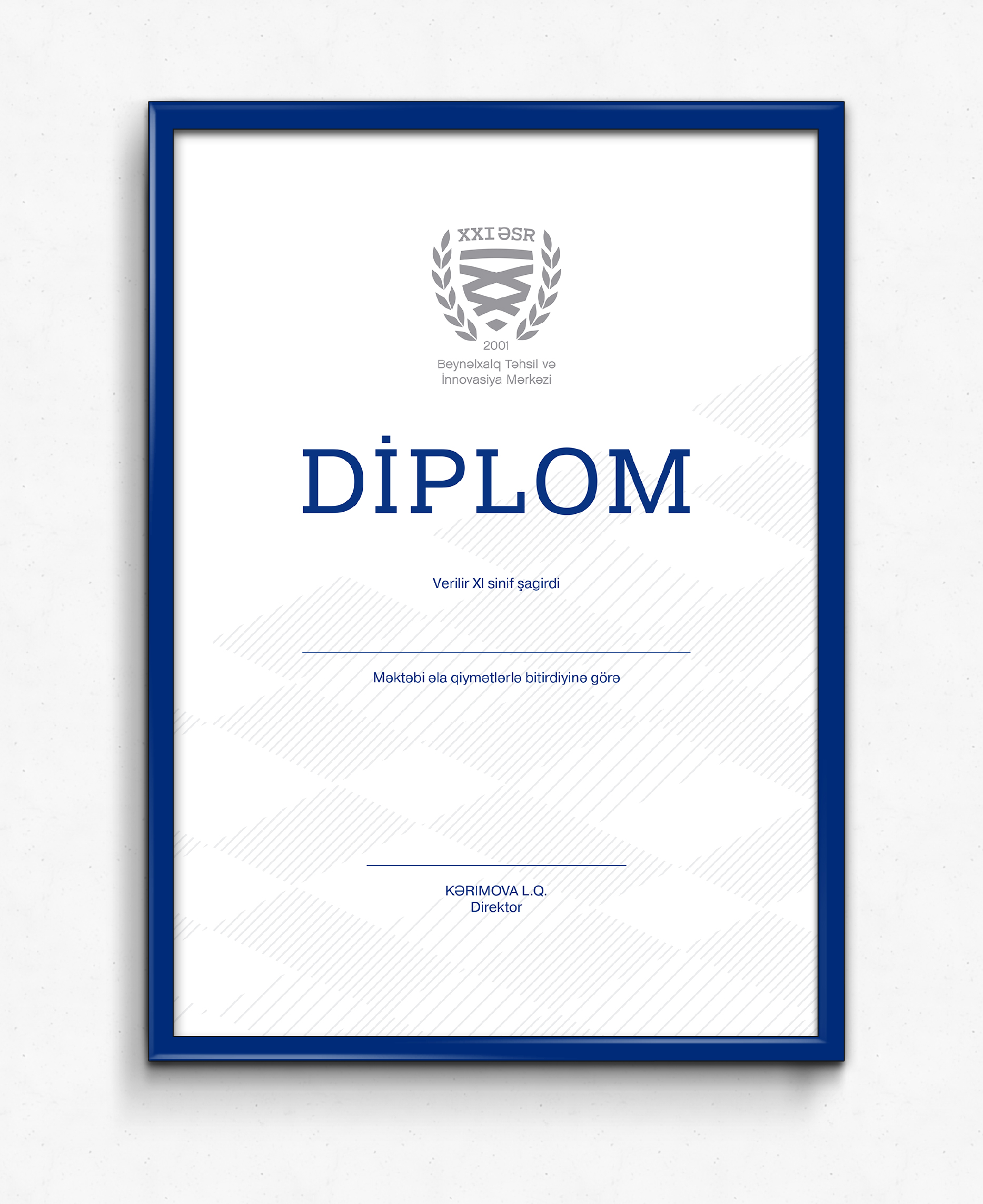
Filling it with books and flasks would have looked like a stock logo. So I turned the Roman numerals XXI into the shield itself, and the name became the crest.

Small enough for a blazer, big enough for a building
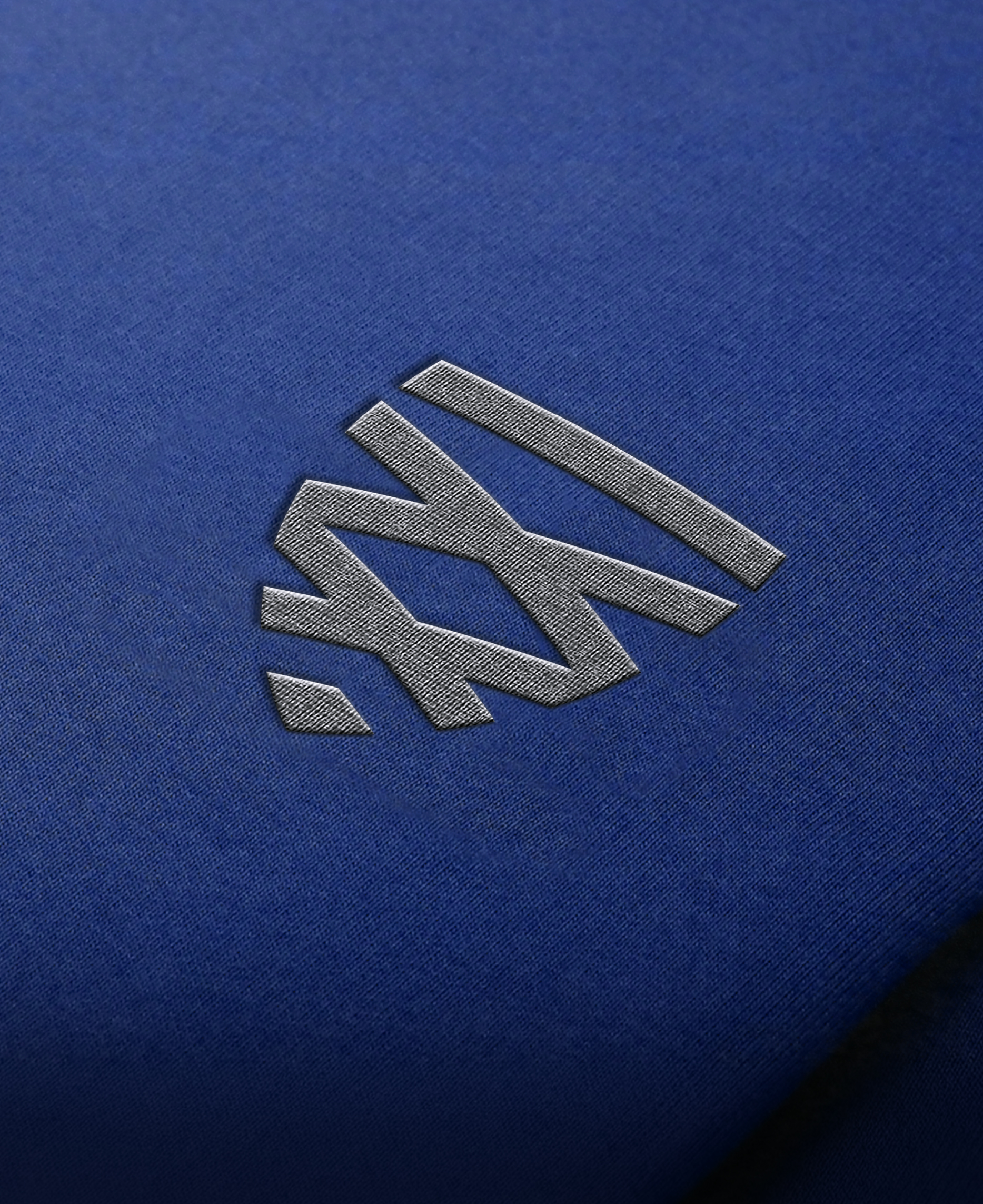
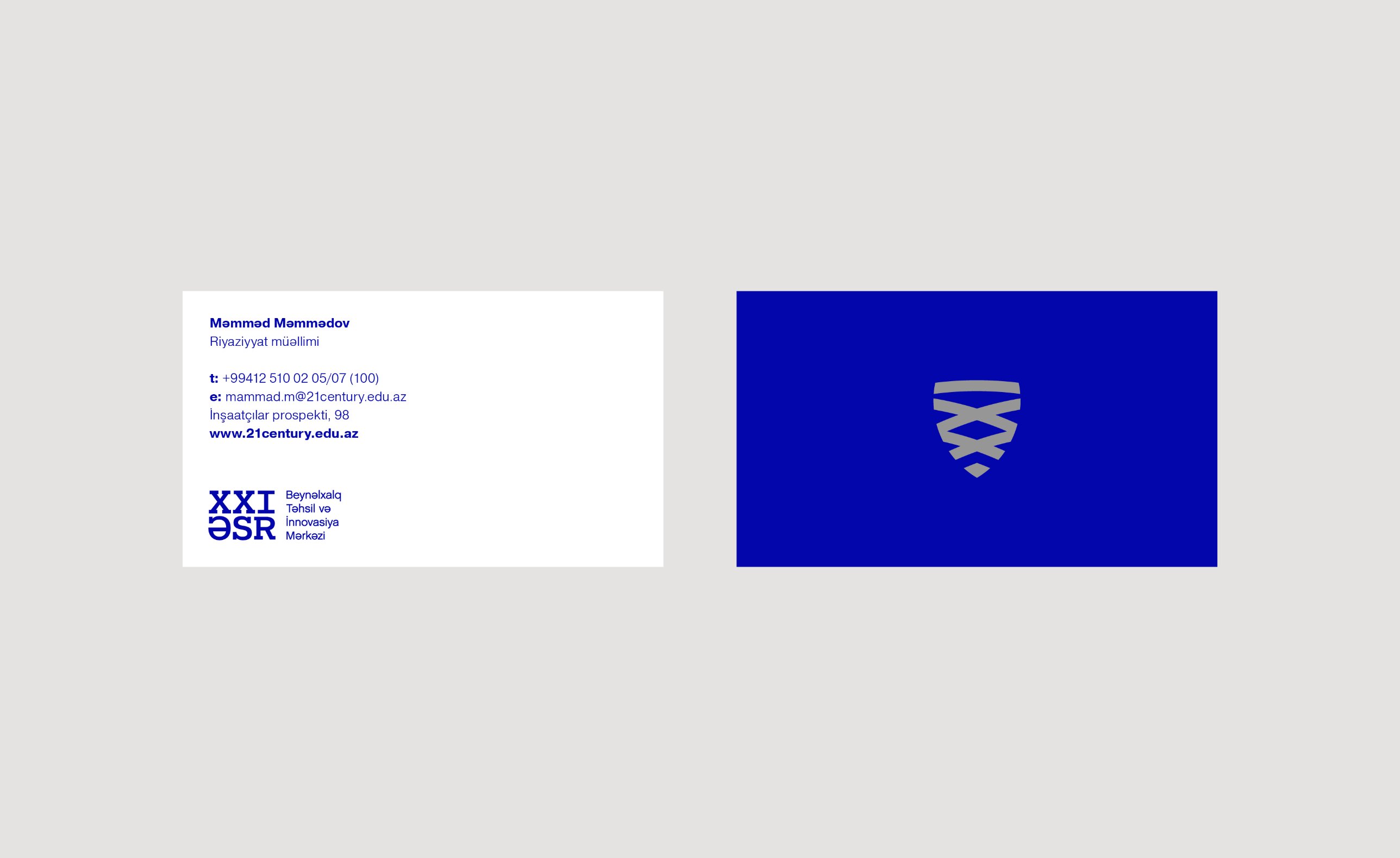
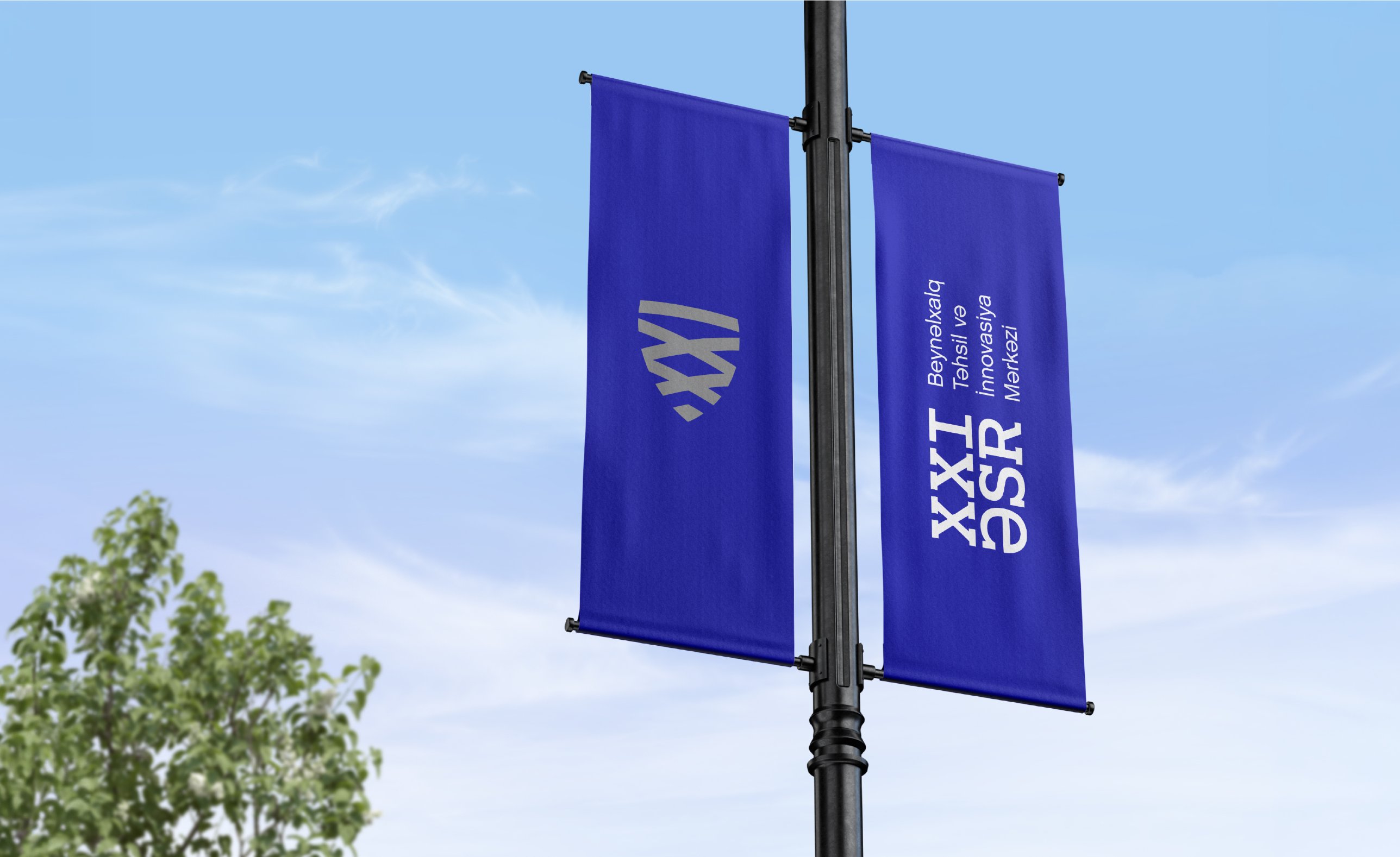
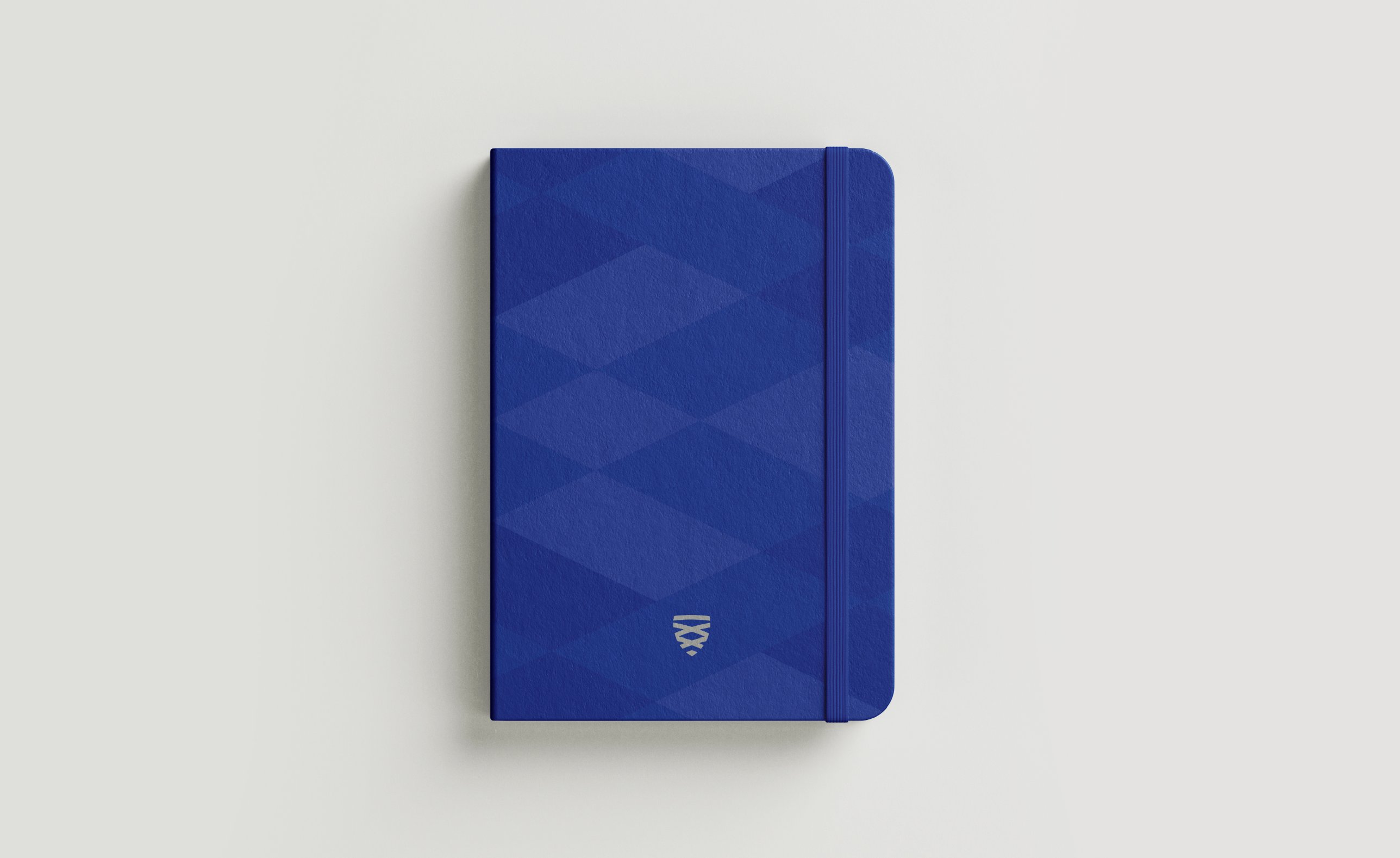
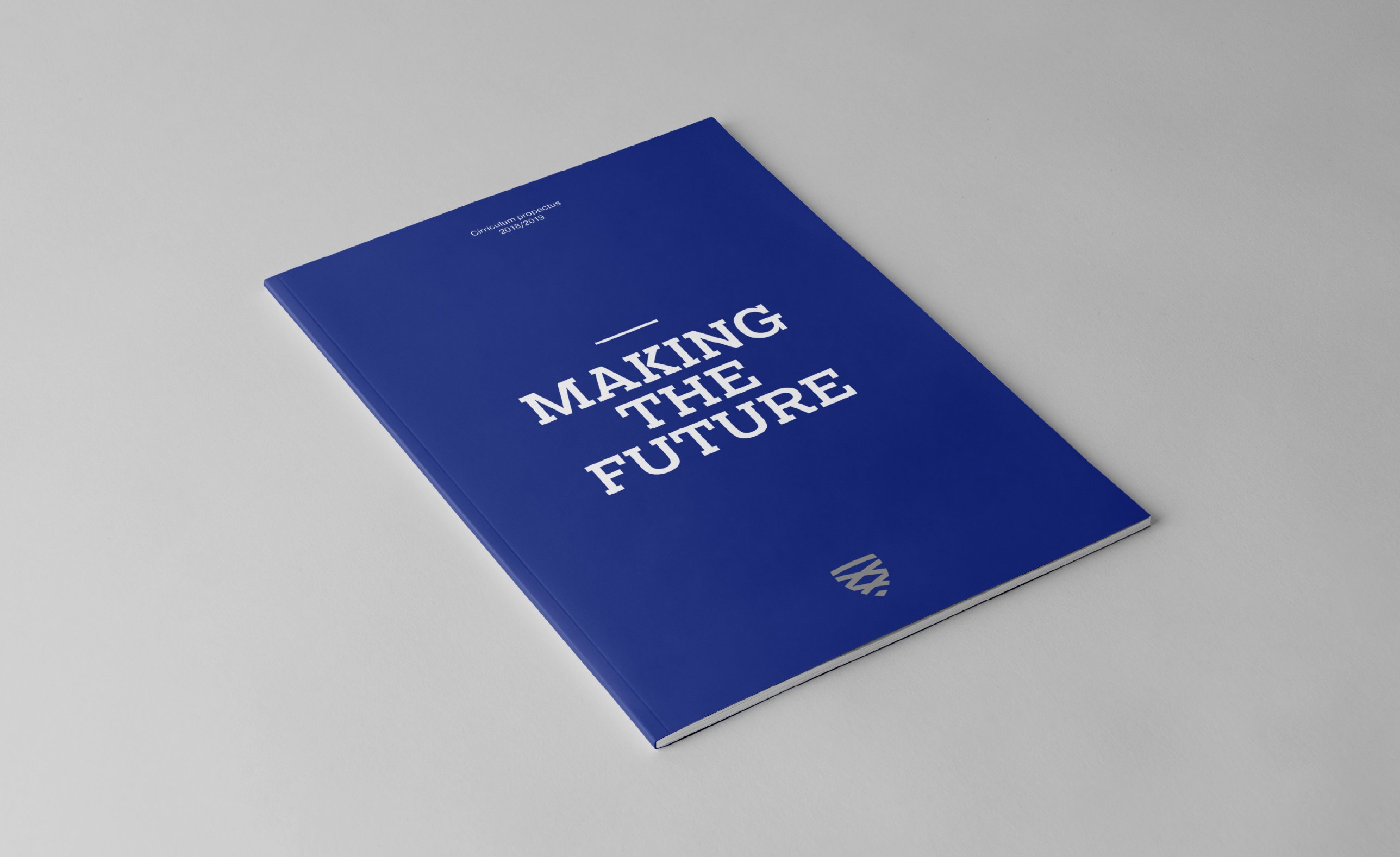
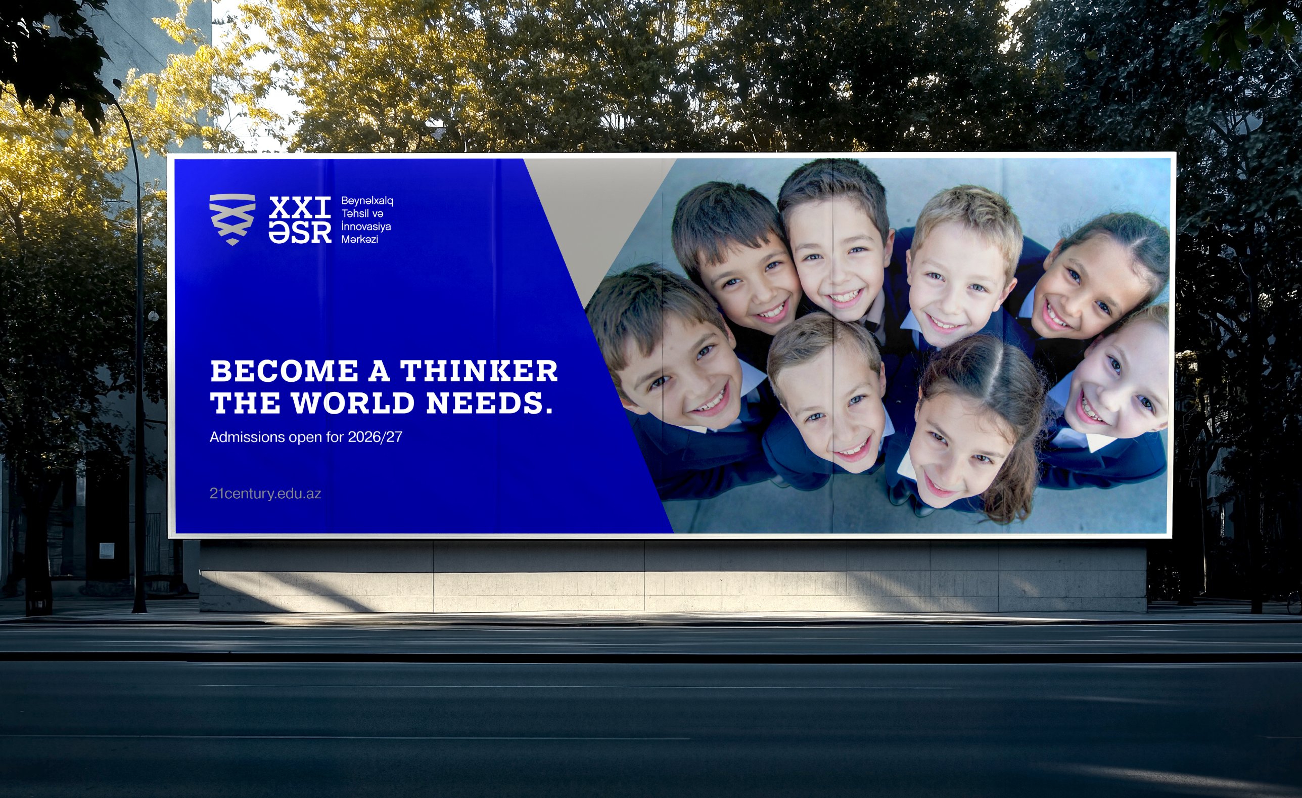
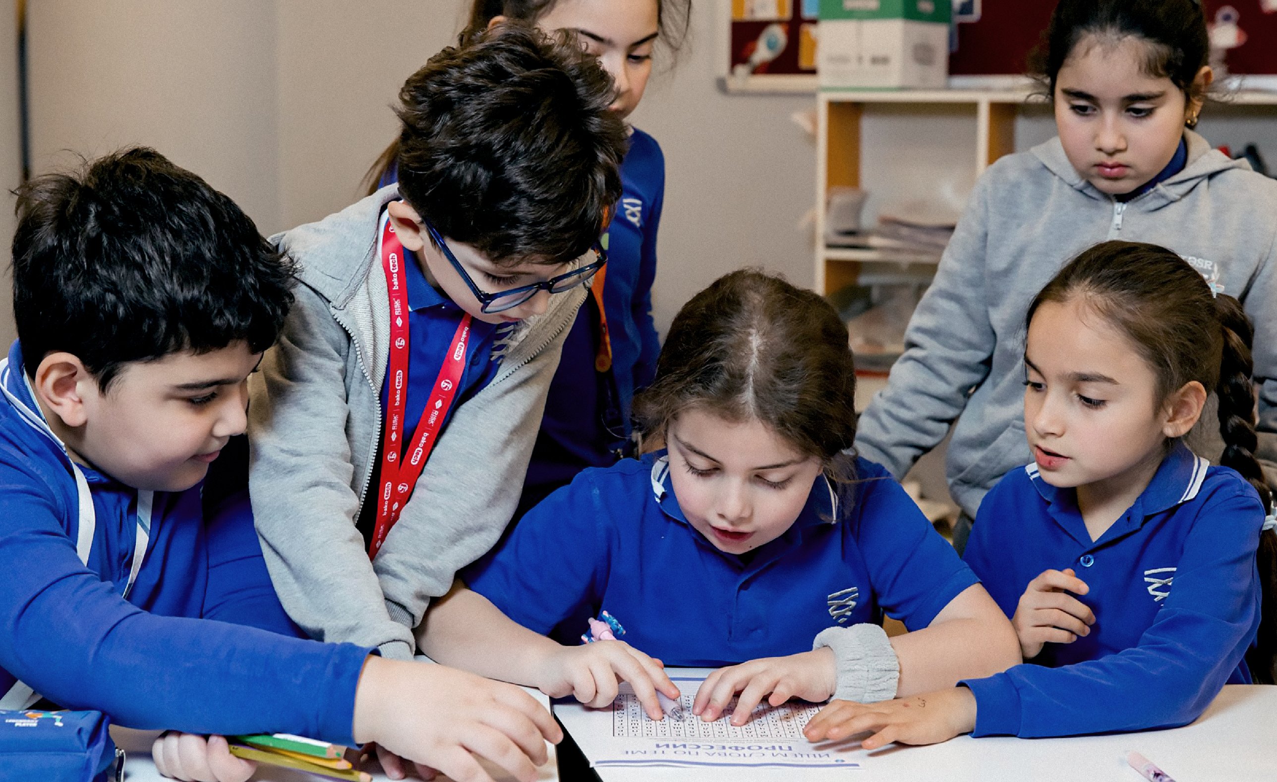
The mark was drawn to stay legible stitched on a blazer and on the side of a building. Around it sit a slab serif wordmark, royal blue, a chevron pattern and sub brands for every part of the school.

The work didn’t stop at launch
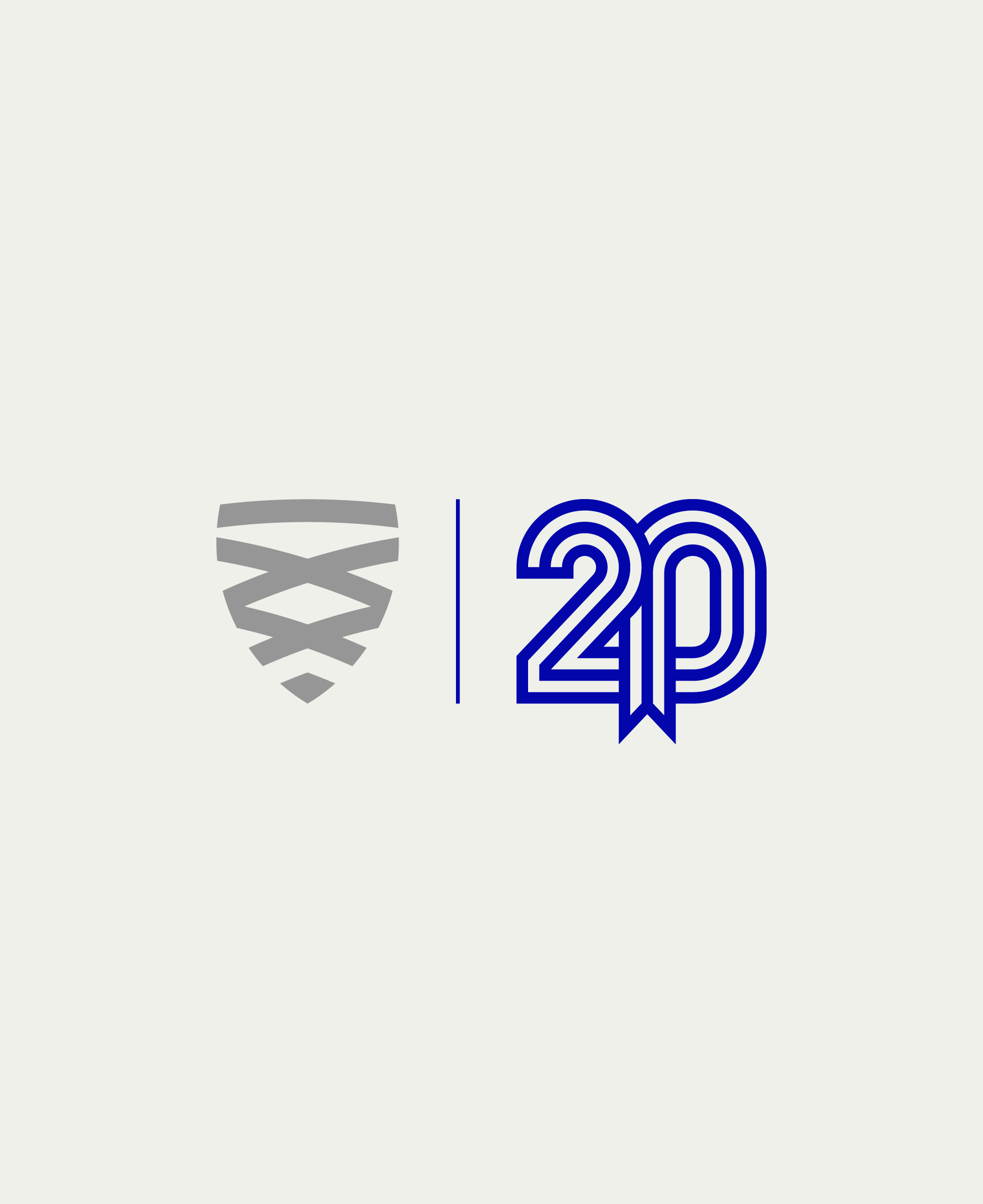
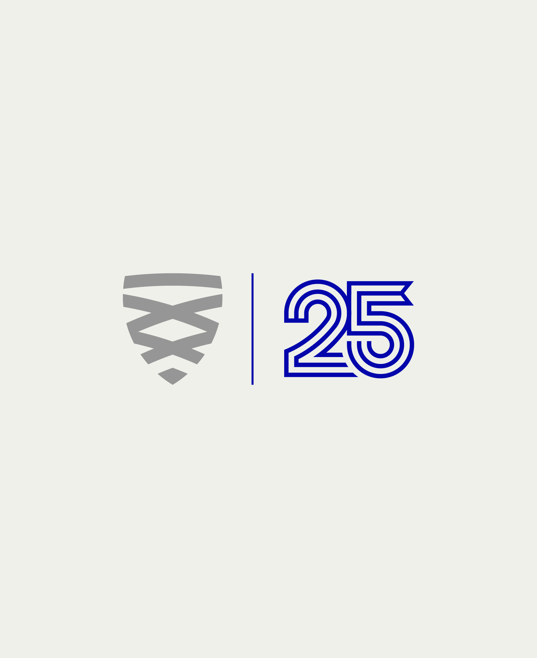
Over the next years I designed the STEAM HUB sub brand, the marks for the 20th and 25th anniversaries, and the wayfinding, interiors, welcome desks and façade.
The shield has carried the school through two anniversaries, and every student wears it.