Kiwitaxi
Kiwitaxi’s service was far better than its logo, a smiling yellow car that looked cheap and childish. I built a brand that looks the way the service already feels.
The service was better than its logo
Kiwitaxi books airport transfers in more than 100 countries and has carried over a million travellers. Its logo was a smiling yellow car, and next to the service people actually got, it looked cheap and childish.
It all started on a weekend bike ride, when the founder asked me to take a look at his website. I ended up looking at a lot more than that.
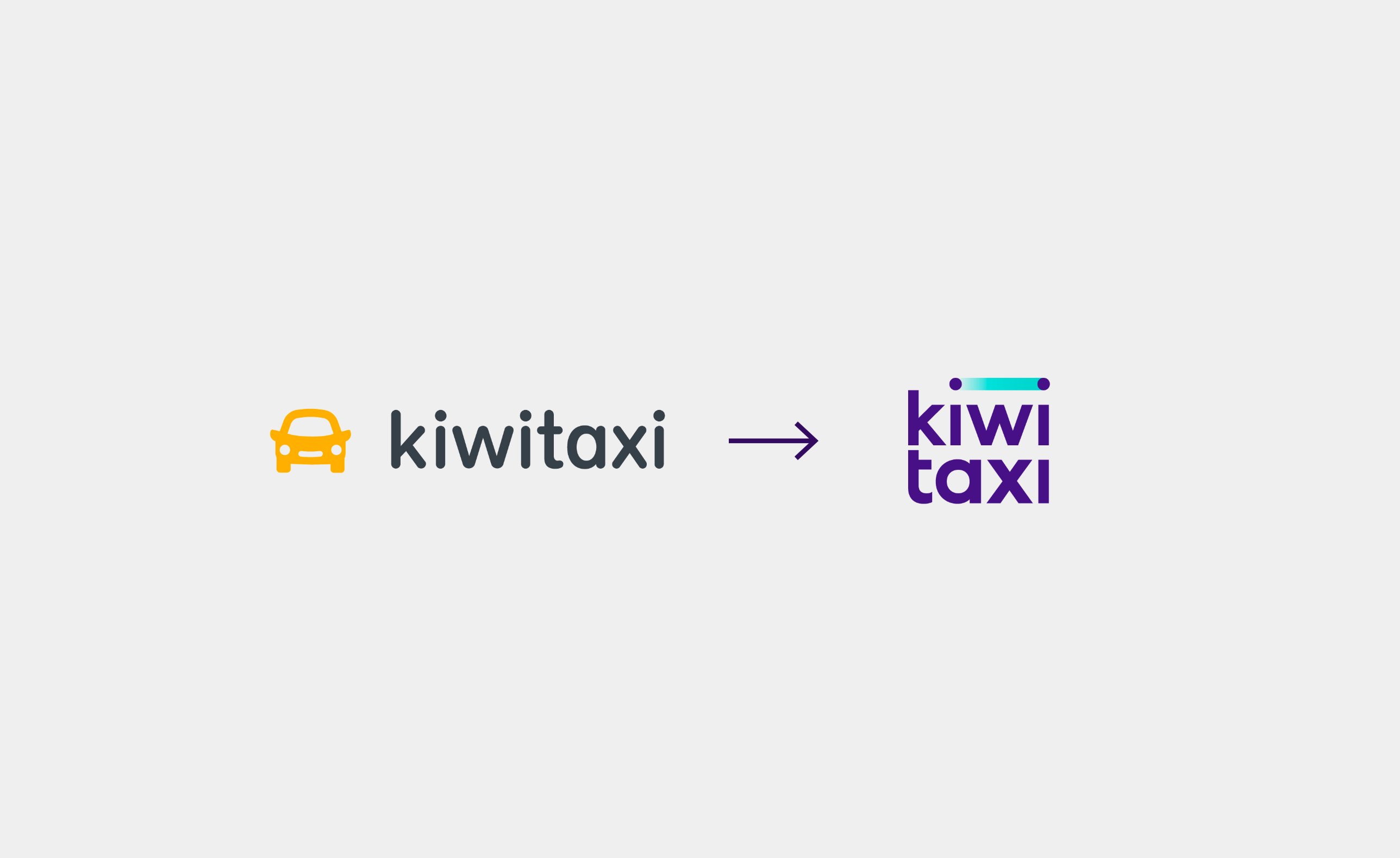
People expected a ride and got hospitality
I studied the category and the competitors while the product owner interviewed real customers. The same story kept coming back: people expected just a ride and got hospitality and peace of mind instead.
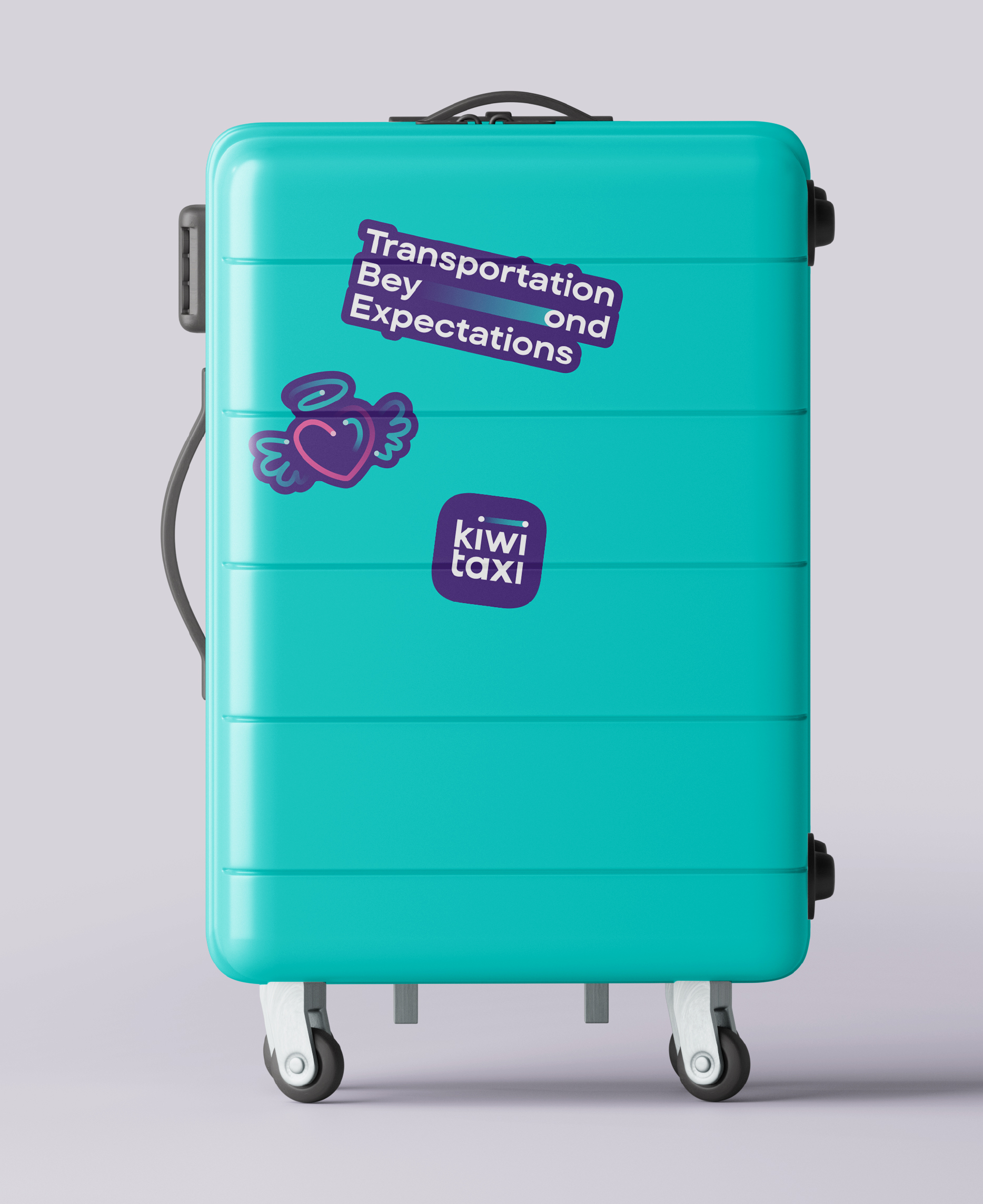
That gap became the positioning and the line Transportation Beyond Expectations. The identity only had to make the brand look the way the service already felt.
A line with no bumps
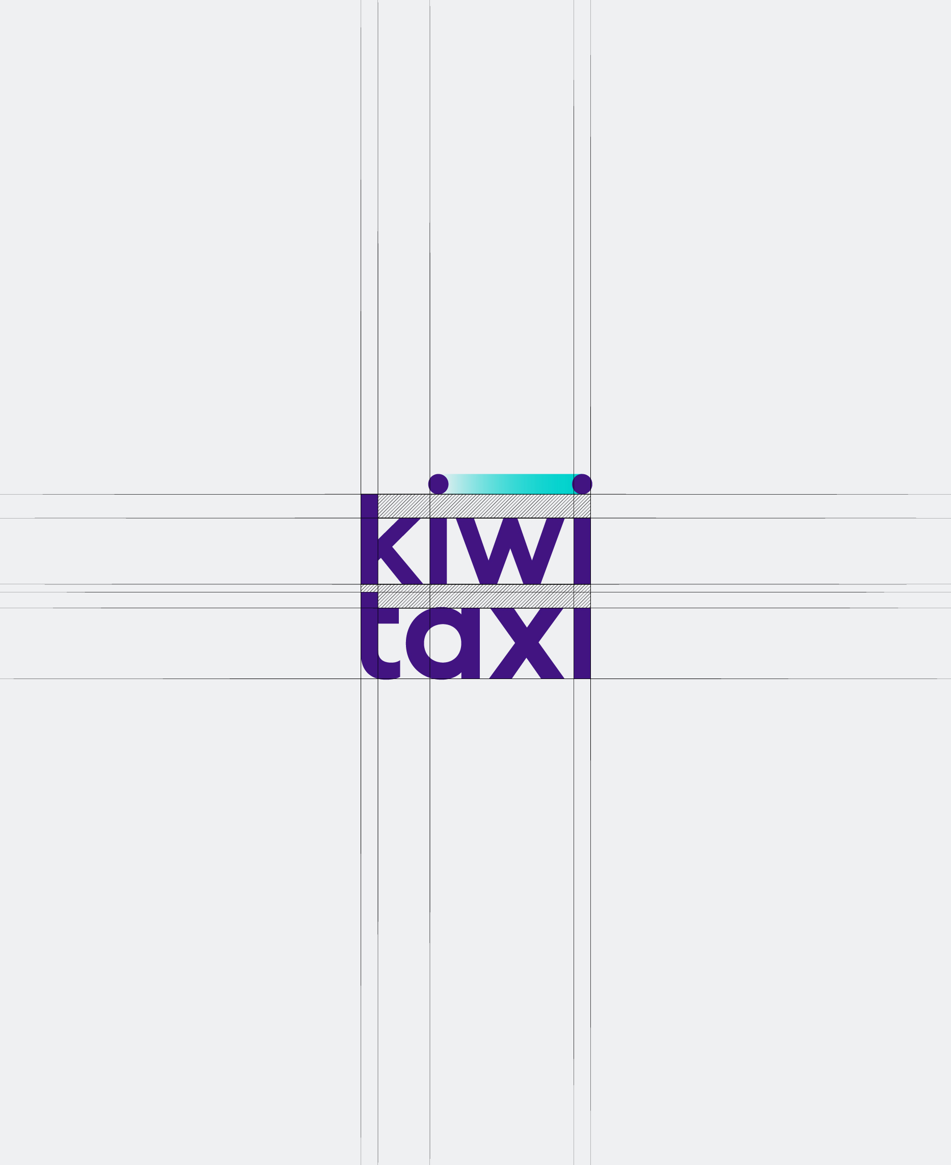
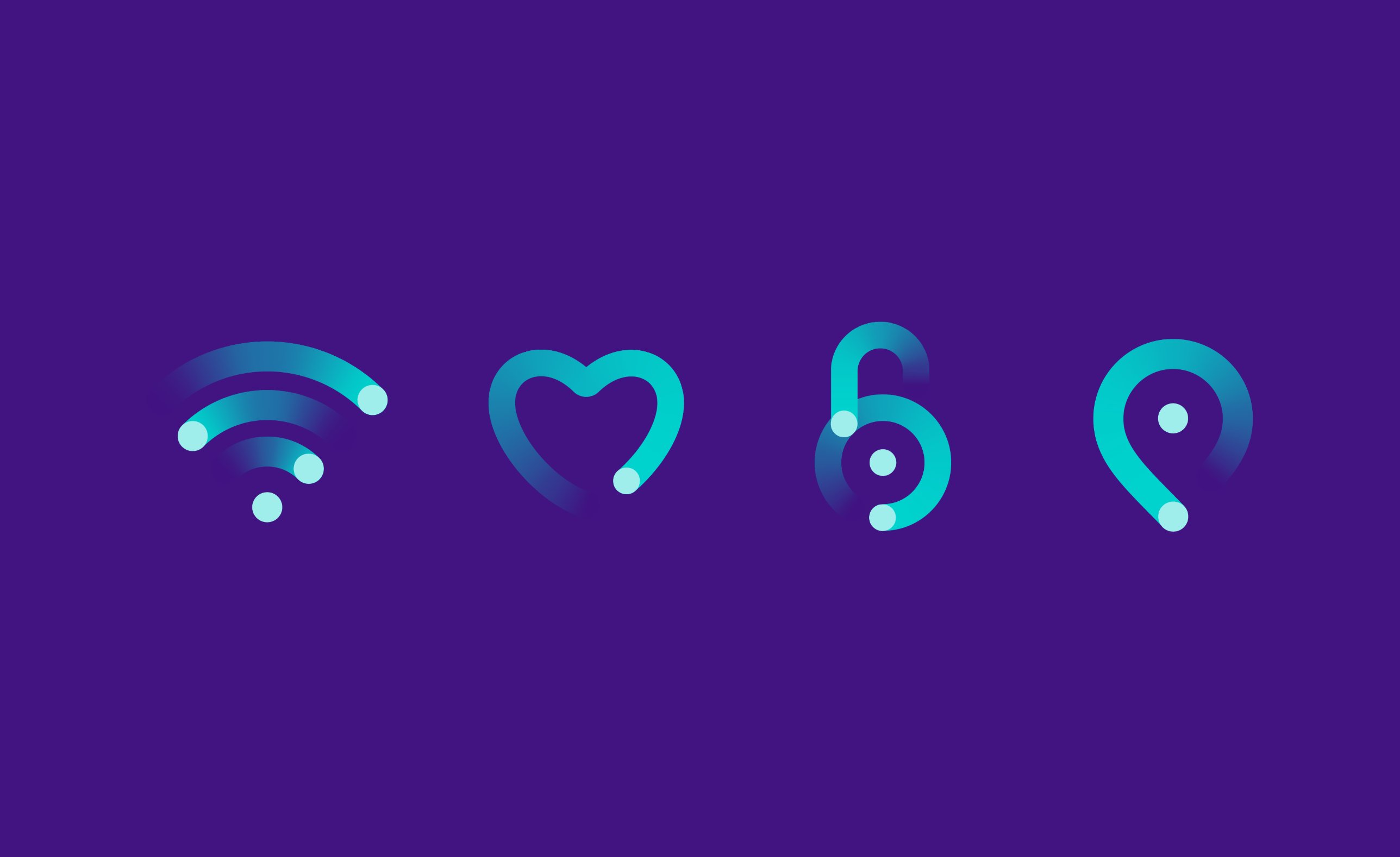
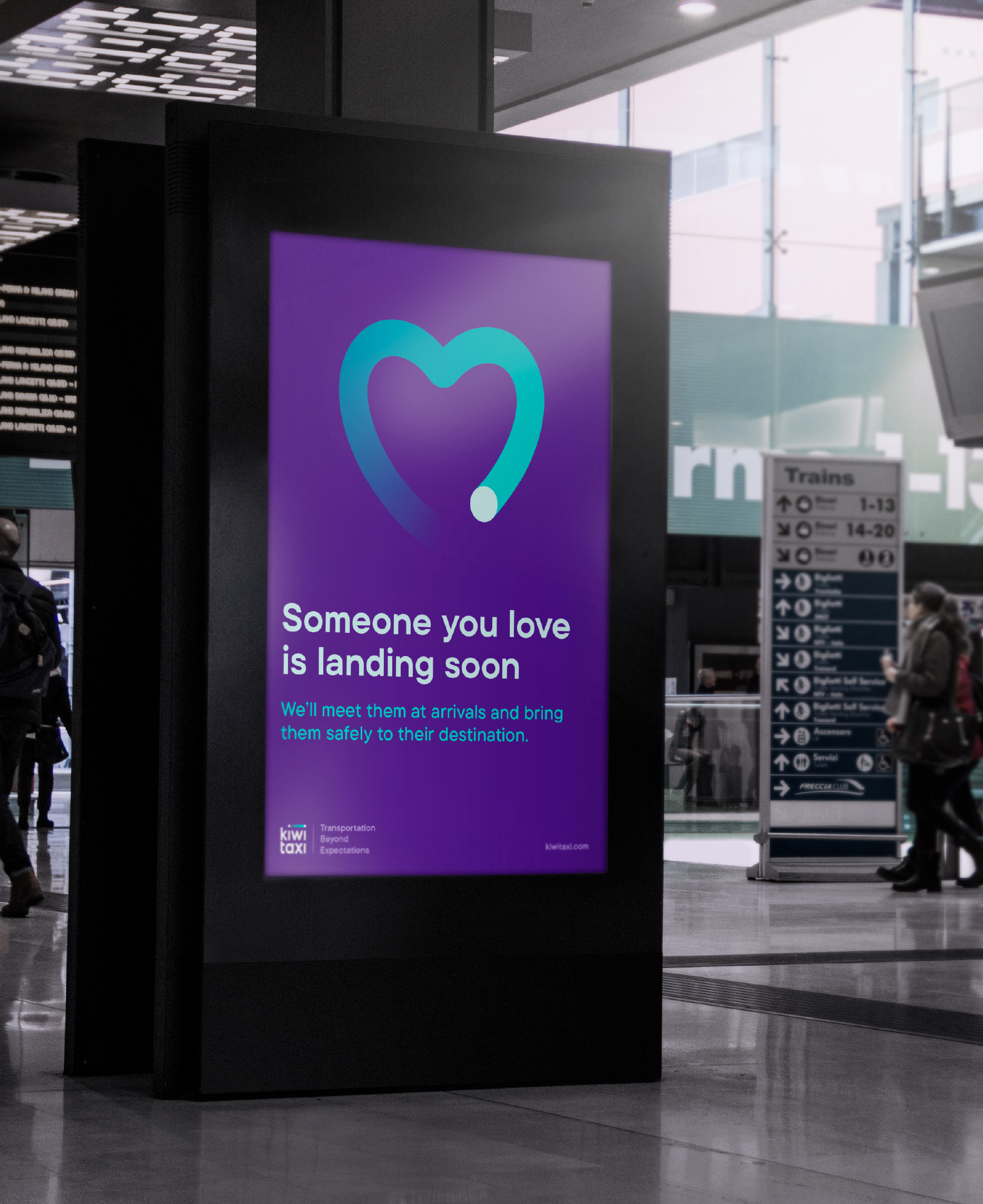
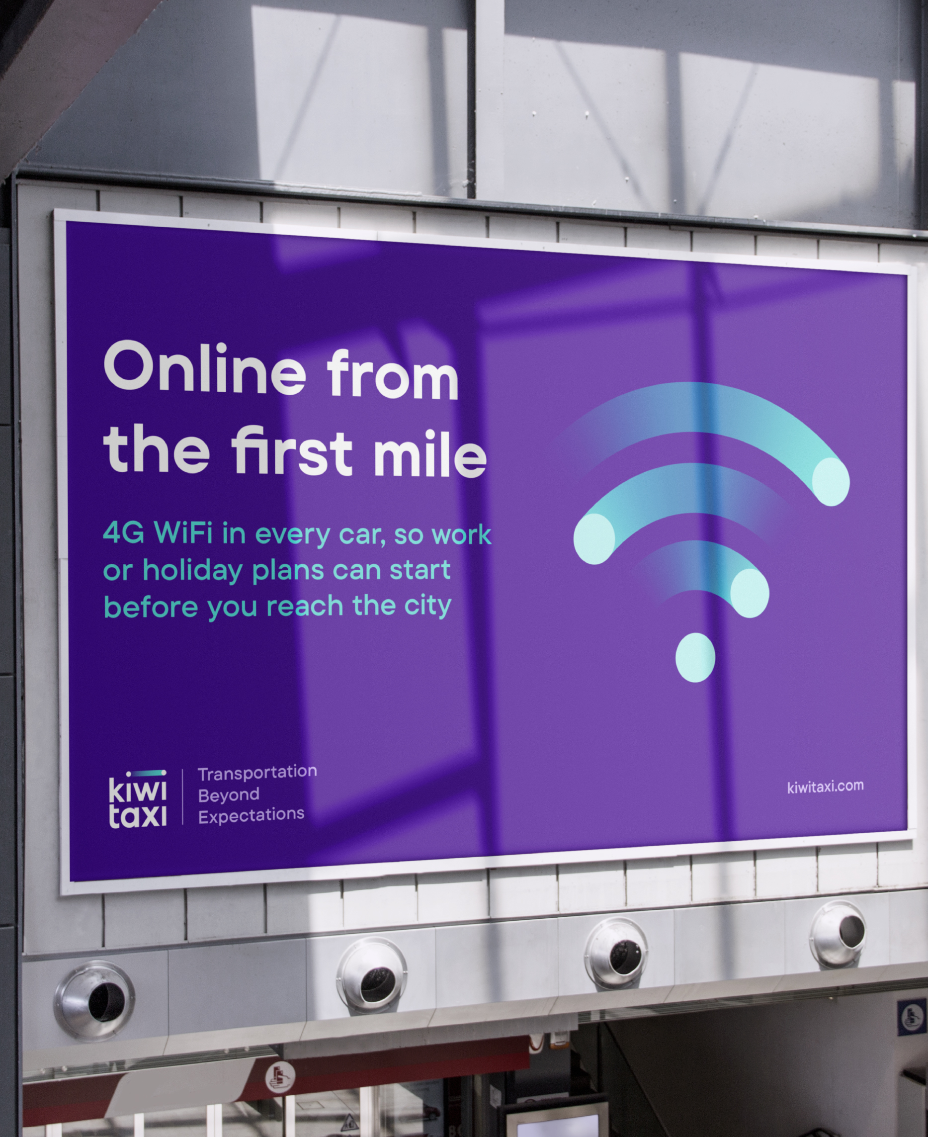
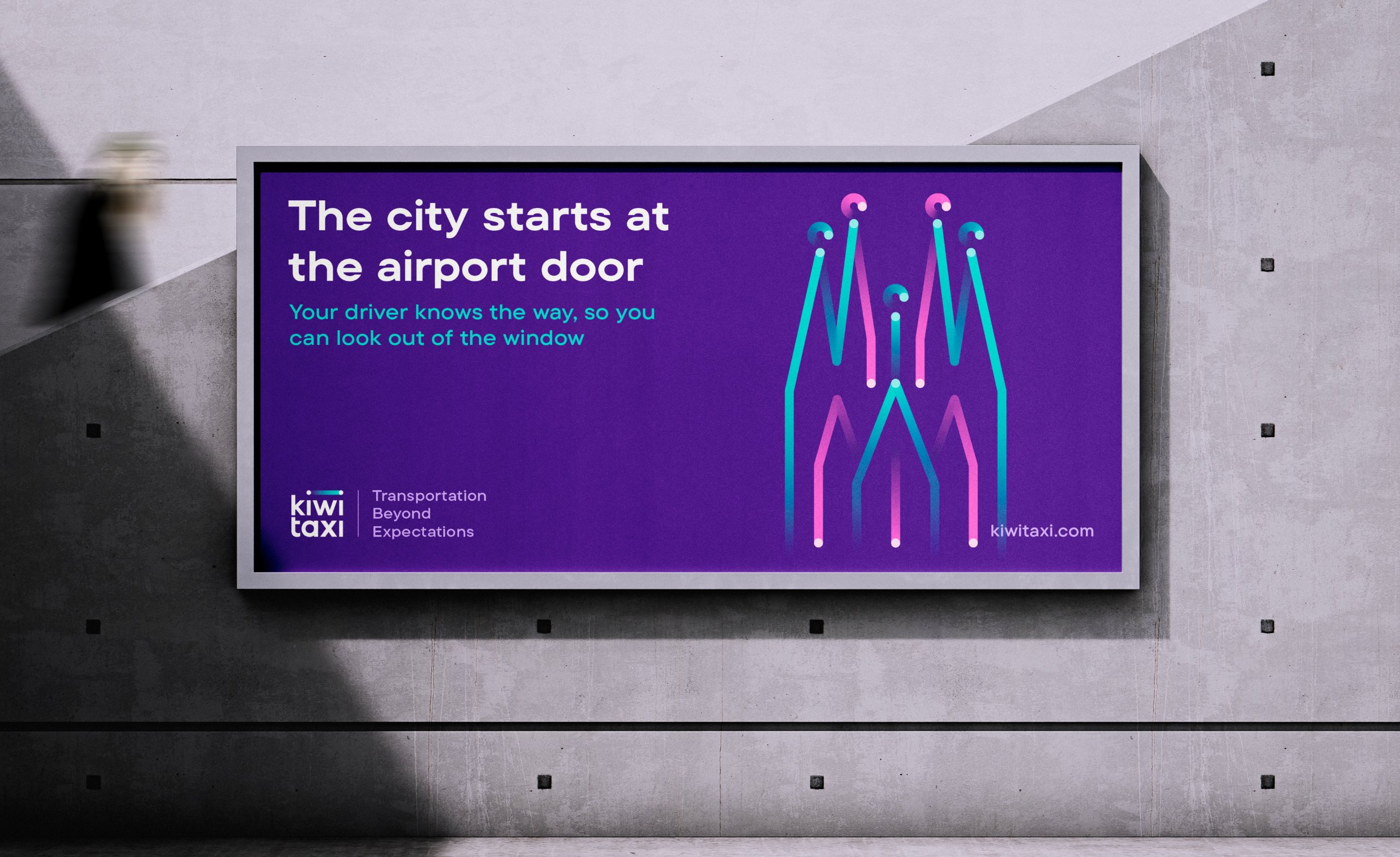
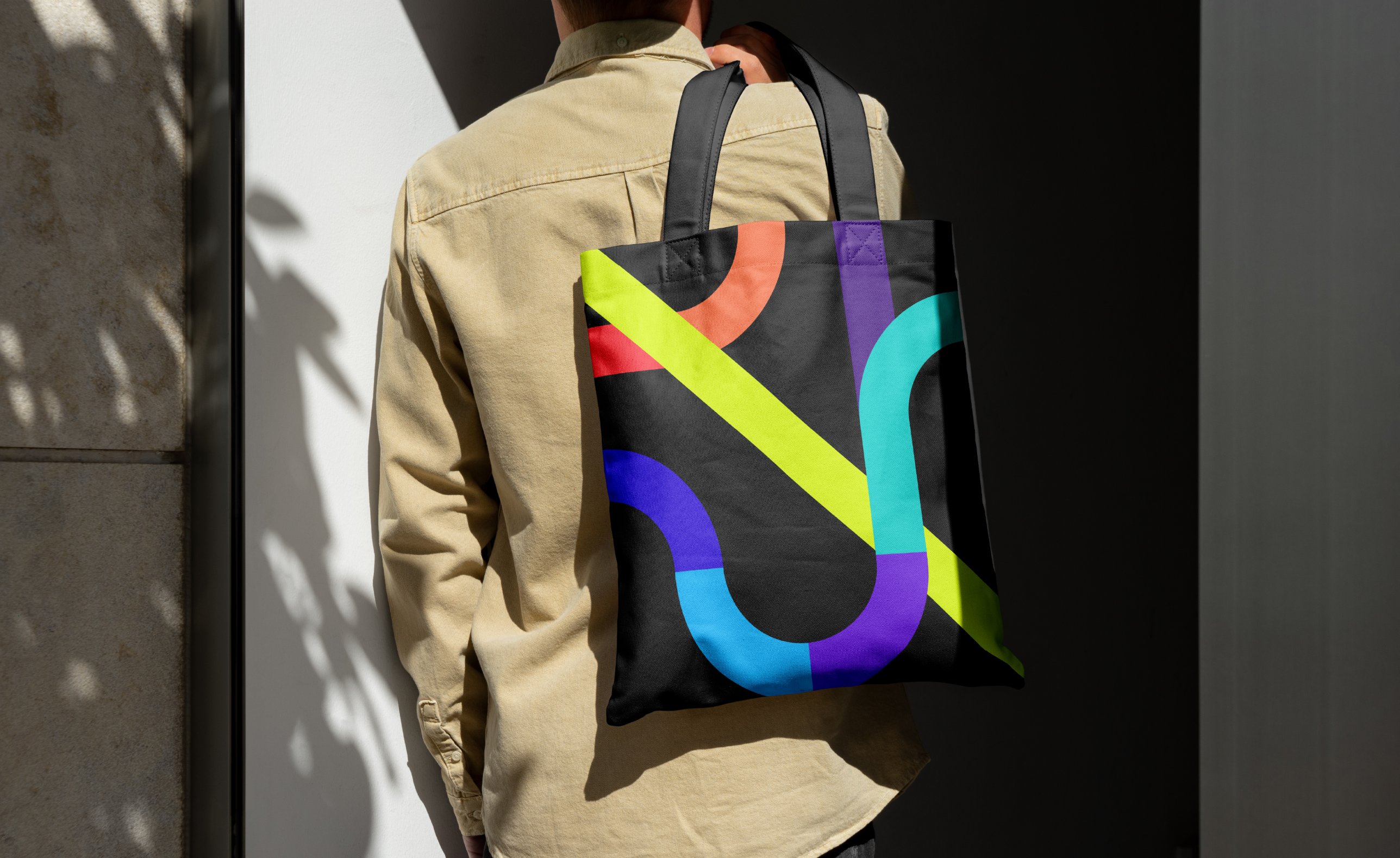
A gradient has no edges, it just flows from one colour into the next. That is the ride Kiwitaxi promises, from the arrivals door to the hotel.
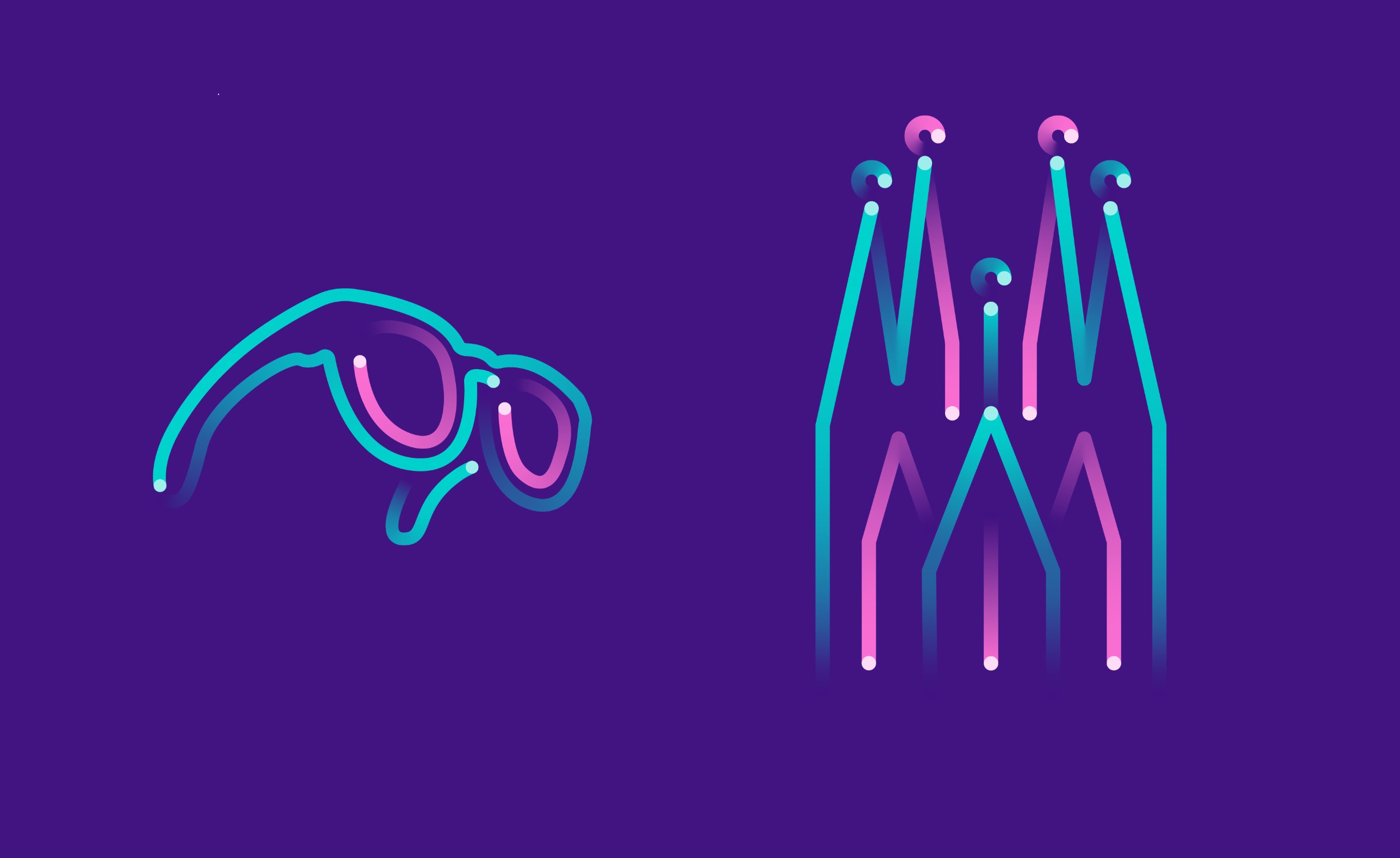
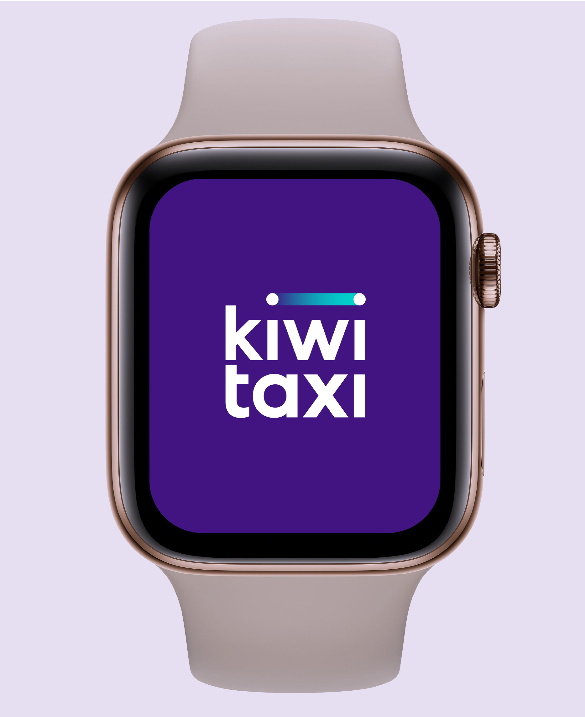
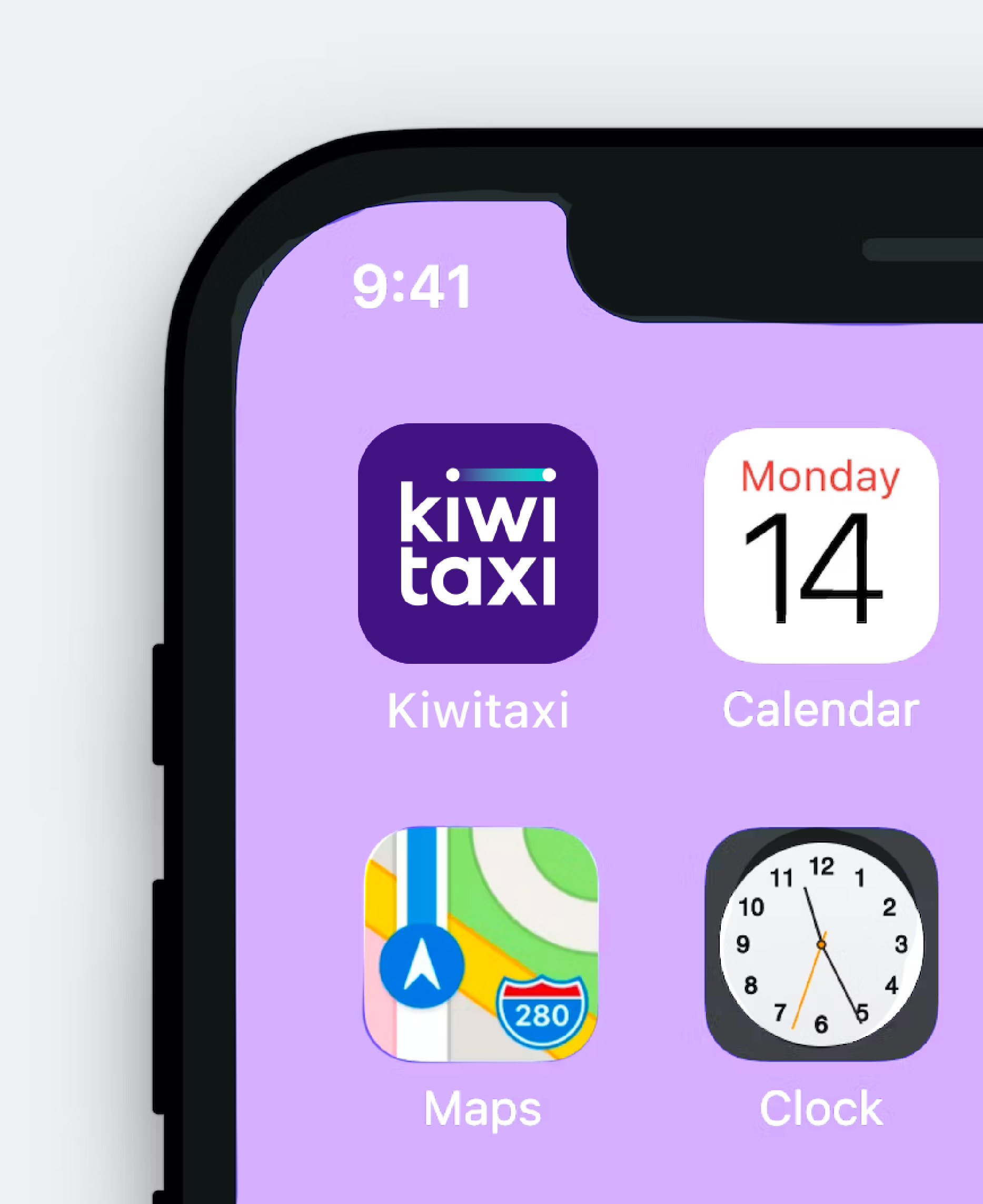
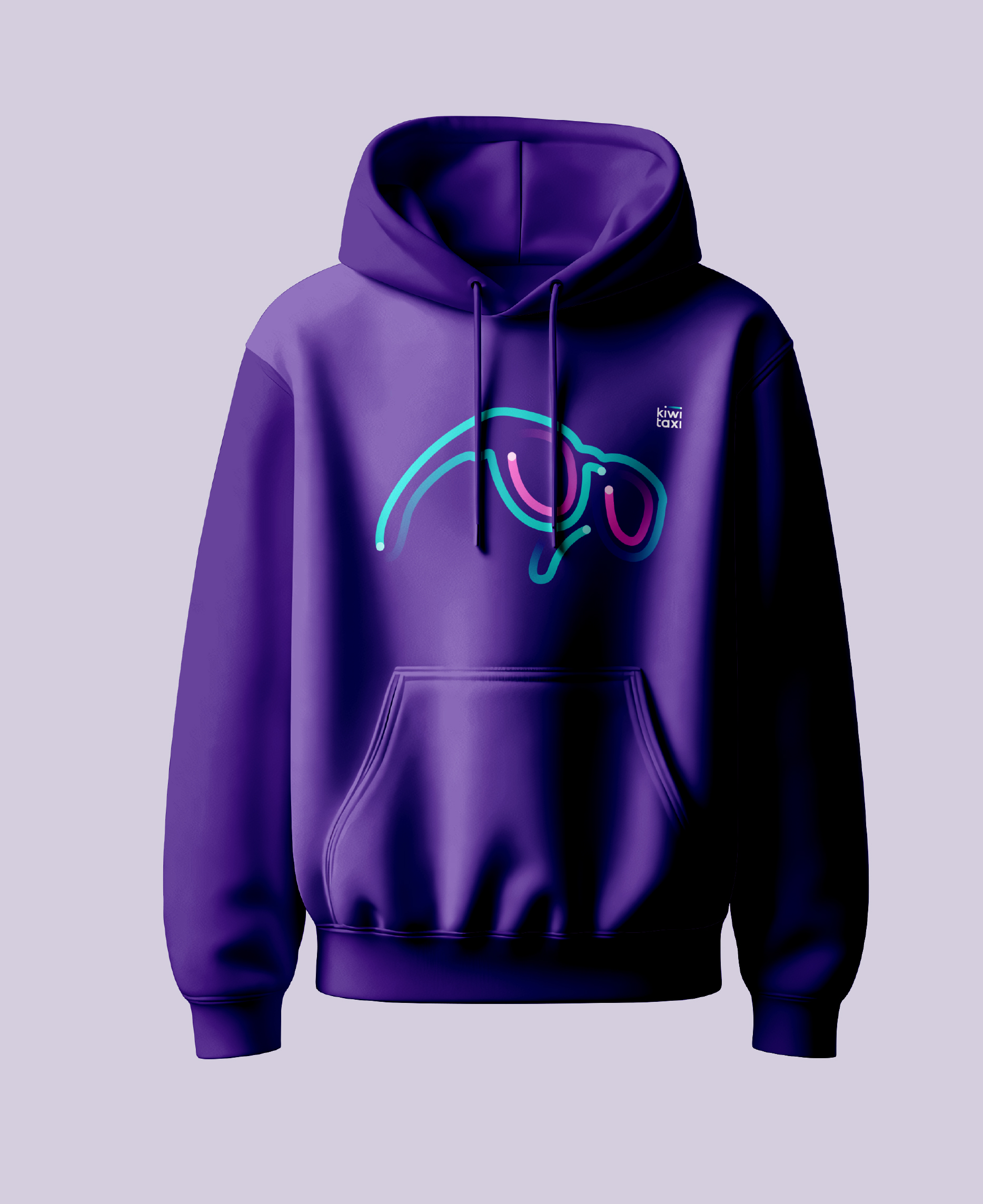
So the ray sits over the name and runs through everything, from icons to illustrations and patterns. The bespoke wordmark keeps one thing from the old brand: the friendly lowercase spelling.
Purple, with its feet on the ground
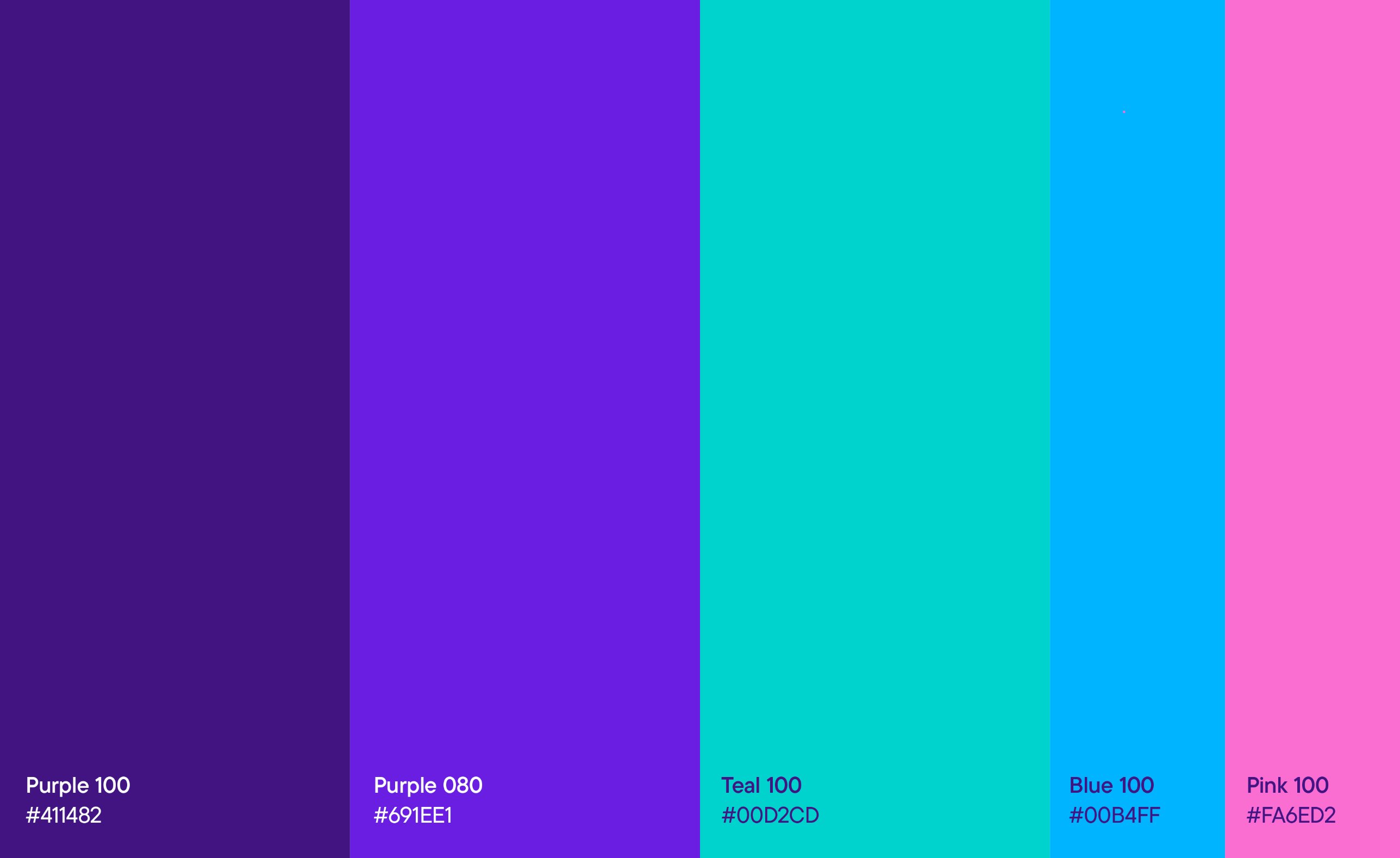
Every competitor wears blue, green or orange. Kiwitaxi went deep purple to stand apart, and turquoise keeps it from tipping into luxury.
It was the most argued decision of the project, and the one that paid off most clearly after launch.

Three months, and still on call
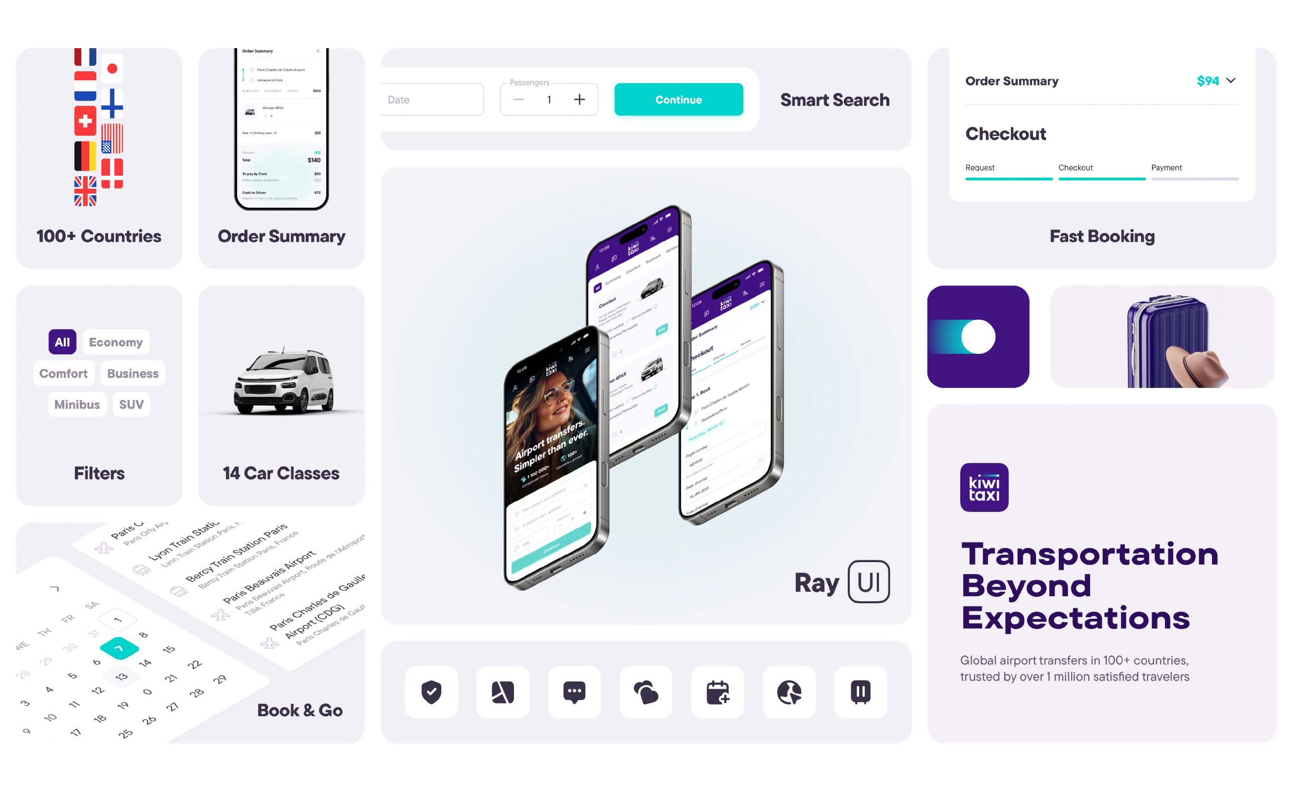
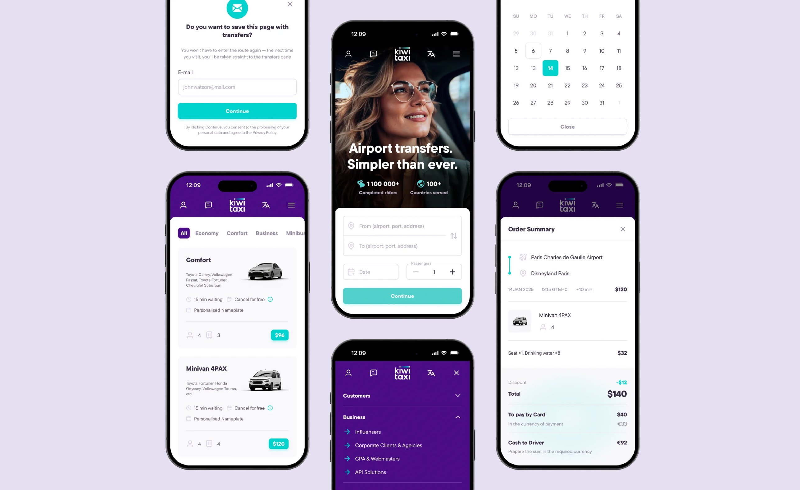
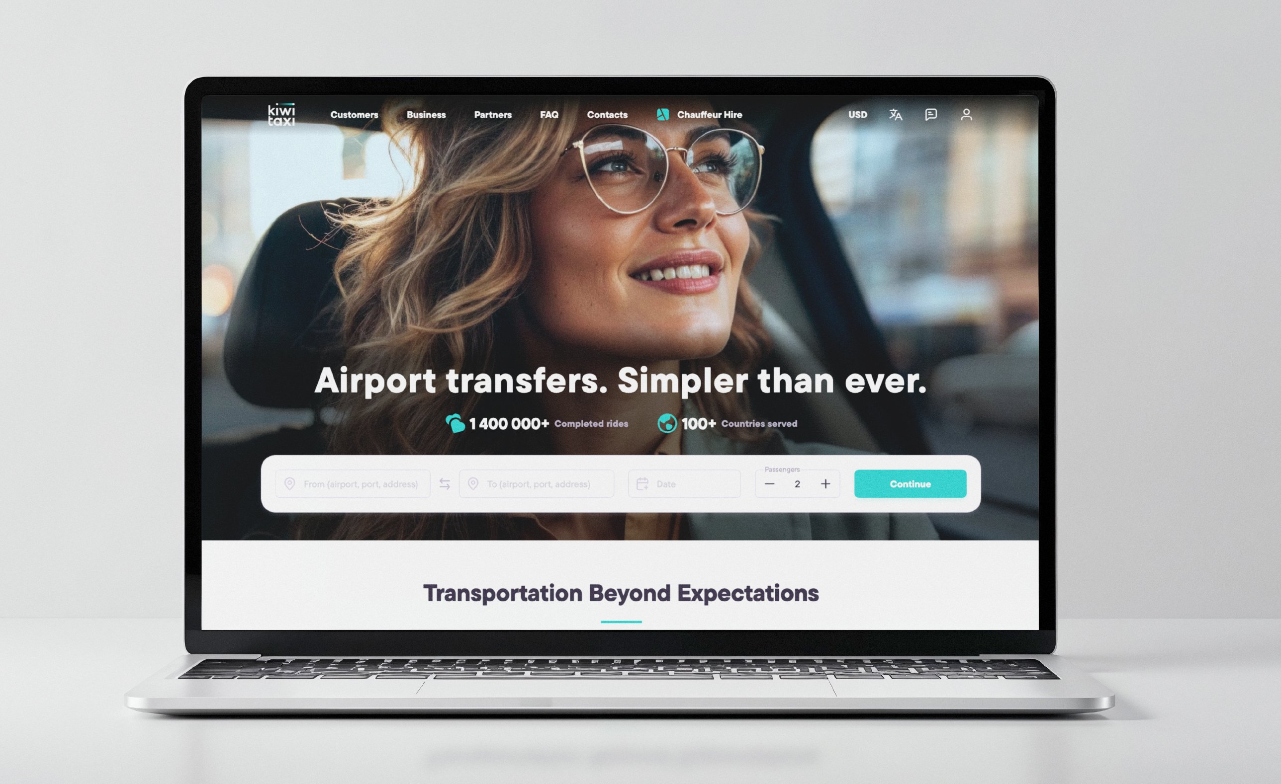
The full identity, from strategy to the asset library, took about three months. I stayed on as brand support while the team built the new website, launched in January 2025, and then the app.
Each stage was presented to the CEO, the product owner and the head of UX and UI.
I still join their quarterly meetings, which says more about the relationship than any brief.
Some brands end up as tattoos
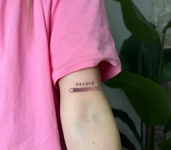
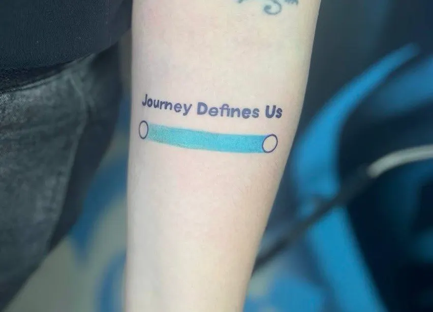
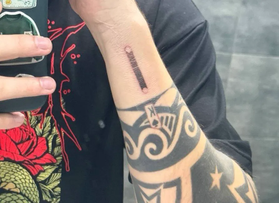
The team took the brand further than any guideline could. The head of operations got the ray tattooed first, and the CEO was looking for a tattoo artist within hours. The CEO told the whole story on the company blog.